Selected FIGURES from

A World of Weather: Fundamentals of Meteorology
A Text/Laboratory Manual, Fourth Edition

Go to Chapter: 1 | 2 | 3 | 4 | 5 | 6 | 7 | 8 | 9 | 10 | 11 | 12 | 13 | 14 | 15 | 16 | 17 | 18


NOTE: All images not in the public domain are subject to copyright. They may be used in the classroom for instructional purposes, but they may not be posted on the World Wide Web or used for any publication without the written consent of Lee Grenci, Jon Nese and David Babb.


Chapter 1: Weather Analysis: The Tools of the Trade


Chapter 2: The Global Ledger of Heat Energy


Chapter 3: Global and Local Controllers of Temperature


Chapter 4: The Role of Water in Weather

  • Figure 4.1 : Eye of Hurricane Ivan, 2004 (courtesy of NASA)
  • Figure 4.3 : The hydrologic cycle
  • Figure 4.4 : Runoff dirties the rivers and bays after Hurricane Ivan (courtesy of NASA)
  • Figure 4.5 : Evaporational cooling in action
  • Figure 4.6a, Figure 4.6b : Annual average potential evaporation and annual average surface temperature (courtesy of Climate Diagnostics Center)
  • Figure 4.8 : Average precipitation rates across Africa and adjacent areas (courtesy of Climate Diagnostics Center)
  • Figure 4.10 : Inside the eye of Hurricane Isabel, 2003 (courtesy of Hurricane Research Division, NOAA)
  • Figure 4.11 : Evaporation and condensation
  • Figure 4.12 : Equilibrium vapor pressure dependence on temperature
  • Figure 4.15 : Fog forms in a classroom
  • Figure 4.16 : Comparison of sizes of various atmospheric particles
  • Figure 4.17a , Figure 4.17b : Comparison of hazy and relatively clear air masses
  • Figure 4.18 : Rising parcels expand and cool
  • Figure 4.19 : Making a cloud in a jar
  • Figure 4.20 : Convective clouds form due to uneven heating of the surface (courtesy of National Weather Service)
  • Figure 4.21 : Definition of leeward and windward
  • Figure 4.22a , Figure 4.22b : California precipitation (courtesy of Oregon Climate Service) and topography (courtesy of Ray Sterner, Johns Hopkins University)
  • Figure 4.23 : Fog in the Conyngham Valley of northeastern Pennsylvania
  • Figure 4.24 : Steam fog over a lake
  • Figure 4.26 : Contrails
  • Figure 4.27 : Contrails from space (courtesy of NOAA)
  • Figure 4.28 : Typical variability of temperature and relative humidity
  • Figure 4.29 : Dependence of relative humidity on temperature
  • Figure 4.30 : Relationship between temperature, dew point, and relative humidity
  • Figure 4.33 : Dew point falls as eddies mix drier air toward surface
  • Figure 4.34 : Temperature and dew point variation ahead of and behind cold front
  • Figure 4.35 : Flat-bottomed "pancake" cumulus clouds
  • Figure 4.36 : High-based clouds form in relative dry low-level air
  • Figure 4.37 : Dew point as an estimate of overnight low
  • Figure 4.38c , Figure 4.38b , Figure 4.38c : Dew-point pattern (courtesy of Plymouth State University), radar (courtesy of WSI Corporation), and storm reports (courtesy of Storm Prediction Center) for severe weather outbreak in April, 2003
  • Figure 4.40 : Thick cumulonimbus clouds have dark bases
  • Figure 4.41 : A waterspout appears dark against a bright background (courtesy of U.S. Navy)
  • Figure 4.47 : Sample dry and moist parcels of air
  • Figure 4.55 : Precipitation/topography correlation in Washington state

Chapter 5: Satellite and Radar Imagery: Remote Sensing of the Atmosphere

  • Figure 5.1 : The "A" ring of Saturn (courtesy of NASA)
  • Figure 5.2 : Doppler radar (courtesy of National Weather Service)
  • Figure 5.3 : Artist's rendition of a polar-orbiting satellite (courtesy of NASA)
  • Figure 5.4 : Orbits of geostationary and polar-orbiting satellites
  • Figure 5.5 : Example satellite image from a polar orbiter (courtesy of NOAA)
  • Figure 5.6a , Figure 5.6b ,Figure 5.6c , Figure 5.6d : Visible, infrared, "negative" infrared, and water vapor satellite images of the same storm (courtesy of NOAA)
  • Figure 5.7 : Albedo increases as milk globules increase in water
  • Figure 5.8 : Rivers stand out from snow-covered ground on visible satellite image (courtesy of NOAA)
  • Figure 5.9 : River and forested regions stand out in visible satellite image (courtesy of NOAA and Ray Sterner, Johns Hopkins)
  • Figure 5.10 : In a standard infrared image, cold objects appear dark (courtesy of FLIR Systems, Indigo Operations)
  • Figure 5.11 : Nighttime infrared image (courtesy of NOAA)
  • Figure 5.12a , Figure 5.12b ,Figure 5.12c : Visible, enhanced infrared, and enhanced water vapor satellite images of Hurricane Isabel (courtesy of NOAA)
  • Figure 5.13 : Enhanced infrared image of space shuttle (courtesy of NASA)
  • Figure 5.14 : Full-disk water vapor image (courtesy of NOAA)
  • Figure 5.15 : Dependence of water vapor imagery appearance on column moisture content
  • Figure 5.16 : Water vapor imagery detects high-altitude dry air drawn into Hurricane Isidore (courtesy of NOAA)
  • Figure 5.17 : Radar imagery at same time as Figure 5.6 satellite imagery (courtesy of WSI Corporation)
  • Figure 5.18 : Doppler radar sites in the lower 48 (courtesy of NOAA)
  • Figure 5.19 : Radar-estimated rainfall in parts of Texas, July 2, 2003 (courtesy of National Weather Service)
  • Figure 5.20 : Multisensor estimate of rainfall on July 13, 2004 (courtesy of Middle Atlantic River Forecast Center)
  • Figure 5.21 : "Wet hail" on radar (courtesy of NOAA)
  • Figure 5.22 : Radar beam can miss low, shallow, snow-bearing clouds
  • Figure 5.24 : Misleading high reflectivities of "wet sleet" (courtesy of National Weather Service)
  • Figure 5.25a , Figure 5.25b : Reflectivity and velocity mode radar images of tornadic thunderstorm near Oklahoma City (courtesy of NOAA)
  • Figure 5.26 : The Doppler effect illustrated with a moving train
  • Figure 5.27 : Application of the Doppler effect to weather radar
  • Figure 5.28 : A wind profiler (courtesy of NOAA)
  • Figure 5.29 : Data measured by a wind profiler (courtesy of NOAA)

Chapter 6: Surface Patterns of Pressure and Wind

  • Figure 6.2 : Fierce "November gales" took similar tracks through the Great Lakes in 1975 and 1998 (courtesy of Don Rolfson, National Weather Service)
  • Figure 6.3 : Pressure as the weight of air
  • Figure 6.4 : Schematic of a mercury barometer
  • Figure 6.5 : Range of measured sea-level pressures on earth
  • Figure 6.6 : Visible satellite image of Typhoon Tip, October 1979 (courtesy of NOAA)
  • Figure 6.7 : High resolution satellite imagery of Denver (courtesy of NASA)
  • Figure 6.8 : Air columns over low and high elevations
  • Figure 6.9 : Various of pressure with altitude
  • Figure 6.10 : Surface pressure compared to sea-level pressure
  • Figure 6.11 : "Correcting" station pressure to sea-level pressure
  • Figure 6.13 : Sea-level pressure analysis of record-setting high pressure system (courtesy of Climate Diagnostics Center)
  • Figure 6.14 : Troughs and ridges
  • Figure 6.15 : Water motions demonstrate the pressure gradient force
  • Figure 6.16 : Average sea-level pressure across the globe (courtesy of Climate Diagnostics Center)
  • Figure 6.17 : Pressure gradient force and gravity balance
  • Figure 6.19 : Fast-moving objects have great momentum (courtesy of NASA)
  • Figure 6.20 : Wind speed increases with height
  • Figure 6.21 : Centrifugal force at the amusement park
  • Figure 6.22 : Speed of rotation varies with latitude
  • Figure 6.23a , Figure 6.23b , Figure 6.23c : Lessons learned on a football field can be applied to the atmosphere
  • Figure 6.24 : The Coriolis force at work on north-south movement
  • Figure 6.25 : The Coriolis force at work on east-west movement
  • Figure 6.26a , Figure 6.26b : Sea-level pressure analysis and satellite imagery of Hurricanes Frances and Ivan, September 2004 (courtesy of NOAA)
  • Figure 6.27 : Air flow around surface highs and lows
  • Figure 6.29 : Implications of surface convergence and divergence
  • Figure 6.30 : Cross section of a surface high and low pressure system
  • Figure 6.31 : Precipitation correlation with pressure systems
  • Figure 6.32a , Figure 6.32b : Satellite image of Hurricane Ivan (courtesy of NOAA), and sea-level pressure trace at Mobile, AL around landfall
  • Figure 6.33a , Figure 6.33b : Pressure "tide" on the Pacific Island of Nauru
  • Figure 6.34 : Fronts and the pressure pattern
  • Figure 6.35 : Cold front in a trough of low pressure
  • Figure 6.36 : Finding fronts on a weather map
  • Figure 6.37 : Upper-level convergence and divergence above surface highs and lows

Chapter 7: Upper-air Patterns of Pressure and Wind


Chapter 8: The Role of Stability in Weather


Chapter 9: Thunderstorms

  • Figure 9.1 : Satellite image shows "numerous" thunderstorms (courtesy of NOAA)
  • Figure 9.2 : A cumulonimbus (thunderstorm) cloud (courtesy of National Weather Service)
  • Figure 9.3a , Figure 9.3b : Benjamin Franklin flies a kite (courtesy of NOAA)
  • Figure 9.4 : One model of charge separation in a cumulonimbus cloud
  • Figure 9.5a : Charge distribution inside a thunderstorm: another possibility
  • Figure 9.6 : Cloud-to-ground lightning (courtesy of NOAA)
  • Figure 9.7 : Lightning originating in the upper reaches of a thunderstorm (courtesy of NOAA)
  • Figure 9.8 : A red sprite (courtesy Dave Sentman, Geophysical Institute, University of Alaska-Fairbanks)
  • Figure 9.9 : Evidence of lightning on Saturn (courtesy of NASA)
  • Figure 9.10 : Computing the distance between an observer and a lightning bolt
  • Figure 9.11 : Lightning fatalities by state, 1990-2003 (courtesy Ronald L. Holle, Holle Meteorology & Photography)
  • Figure 9.12 : Hair may stand on end before a lightning strike (courtesy of NOAA)
  • Figure 9.13 : Heating destabilizes the low levels
  • Figure 9.14 : Lightning strikes the Empire State Building (courtesy of National Weather Service)
  • Figure 9.15a , Figure 9.15b : Radar and sounding for an elevated convection case (courtesy of WSI Corporation)
  • Figure 9.16 : Climatology of worldwide lightning strikes (courtesy of NASA MSFC)
  • Figure 9.17 : Average number of days per year with a thunderstorm (courtesy of Oklahoma Climatological Survey)
  • Figure 9.18 : Formation of the sea breeze
  • Figure 9.19 : Weather implications of the sea-breeze front
  • Figure 9.20 : Satellite view of sea-breeze thunderstorms (courtesy of NOAA)
  • Figure 9.21 : Converging sea-breeze fronts
  • Figure 9.22 : Elevated surfaces as sources of uneven heating
  • Figure 9.23a , Figure 9.23b , Figure 9.23c : Sequence of satellite images shows elevated convection (courtesy of NOAA)
  • Figure 9.24 : The low-level environment's affect on cloud base height
  • Figure 9.25 : Thunderstorm Project marker (courtesy of NOAA)
  • Figure 9.26 : Stages in an air-mass thunderstorm
  • Figure 9.27 : Role of entrainment in the growth of cumulus clouds
  • Figure 9.28 : A glaciated anvil atop a thunderstorm (courtesy of NOAA)
  • Figure 9.29 : Overshooting tops from above (courtesy of NASA)
  • Figure 9.31 : Radar detects the sea-breeze front thanks to insects (courtesy of NOAA)
  • Figure 9.32 : Dust storms produced by gust fronts (courtesy of NASA)
  • Figure 9.33a , Figure 9.33b , Figure 9.33c , Figure 9.33d , Figure 9.33e , Figure 9.33f , Figure 9.33g , Figure 9.33h , Figure 9.33i , Figure 9.33j : Life cycle of an MCC (courtesy of NOAA)
  • Figure 9.34 : Contribution of sloped terrain to the enhancement of a low-level jet
  • Figure 9.35a , Figure 9.35b , Figure 9.35c , Figure 9.35d : Satellite and radar images, and low-level jet contribution, to an MCC (courtesy of NOAA, University of Wisconsin/CIMMS, and WSI Corporation)
  • Figure 9.36 : Cross-sectional view of an MCC
  • Figure 9.39 : A map of precipitable water
  • Figure 9.40 : Four weather patterns conducive to flash flooding
  • Figure 9.41 : Average number of days per year with hail of at least 3/4" diameter (courtesy of Harold Brooks, National Severe Storms Laboratory)
  • Figure 9.42 : Radar cross section of a hail-producing thunderstorm (courtesy of National Weather Service)
  • Figure 9.43 : Cornfield decimated by large hail (courtesy of The Institute of Agriculture and Natural Resources Cooperative Extension, University of Nebraska-Lincoln)
  • Figure 9.44 : Largest hailstone on record (courtesy of National Weather Service, Hastings, NE)
  • Figure 9.45 : Schematic of a microburst
  • Figure 9.46 : A WSR-88D radar damaged by microburst winds (courtesy of National Weather Service)
  • Figure 9.47 : A microburst's threat to aviation
  • Figure 9.48 : A Doppler radar velocity image shows a microburst (courtesy of National Weather Service)
  • Figure 9.51 : Ray tracing through a raindrop
  • Figure 9.53 : Following the light that makes a rainbow
  • EXTRA: Kite flying at beach illustrates sea breeze

Chapter 10: Tropical Weather, Part I: Patterns of Wind, Water and Weather

  • Figure 10.1 : The tropics and subtropics occupy half the earth's surface
  • Figure 10.2 : Annual variation of incoming solar and outgoing infrared radiation
  • Figure 10.3 : Average annual air temperatures (courtesy of Climate Diagnostics Center)
  • Figure 10.4 : Average daily high temperatures in St. Louis, MO and Bhopal, India
  • Figure 10.5 : Sea-surface temperature anomalies during the 1997 El Nino (courtesy of Climate Diagnostics Center)
  • Figure 10.6 : Wind rose from Rapid City, SD (courtesy of National Weather Service)
  • Figure 10.7 : Wind rose from an ocean buoy in tropical Pacific just south of the equator
  • Figure 10.8 : Convergence of trade winds at the ITCZ
  • Figure 10.9 : Halley's Comet (courtesy of NASA)
  • Figure 10.10 : Hadley's model of the general circulation
  • Figure 10.11 : Idealized cross section of the Hadley cells
  • Figure 10.12 : Cloud clusters over the Atlantic Ocean (courtesy of NOAA)
  • Figure 10.13 : The ITCZ often appears as a necklace of clouds in tropical regions (courtesy of SSEC, University of Wisconsin, and NOAA)
  • Figure 10.14 : ITCZ wanders into Southern Hemisphere in February (courtesy EUMETSAT/NERC/Dundee University)
  • Figure 10.15a , Figure 10.15b : Average position of the ITCZ in January and July (courtesy of Climate Diagnostics Center)
  • Figure 10.16 : Average monthly rainfall at Fortaleza, Brazil shows a wet season and a dry season
  • Figure 10.17 : Average annual sea-level pressure around the globe (courtesy of Climate Diagnostics Center)
  • Figure 10.18 : Poleward flowing air at high altitudes in the tropics hits a "roadblock" around 30 degrees latitude
  • Figure 10.19a , Figure 10.19b : Average position of Atlantic subtropical high during winter and summer (courtesy of Climate Diagnostics Center)
  • Figure 10.20 : Annual average precipitation rates (courtesy of Climate Diagnostics Center)
  • Figure 10.21 : Major deserts of the world
  • Figure 10.22 : Average wind direction during August 2004 over the tropical Pacific (courtesy of Climate Diagnostics Center)
  • Figure 10.23 : Snow caps on Mauna Loa and Mauna Kea (courtesy of NASA)
  • Figure 10.24 : Average sea-level pressure over the Pacific in August 2004 (courtesy of Climate Diagnostics Center)
  • Figure 10.25 : Why the trade winds achieve speeds faster than what the pressure gradient suggests
  • Figure 10.26 : Trade-wind cumulus (courtesy of NOAA's Hurricane Research Division)
  • Figure 10.27 : Average wind speeds and directions at 200 mb over Asia and the western Pacific (courtesy of Climate Diagnostics Center)
  • Figure 10.28 : The Tibetan Plateau from space (courtesy of NASA)
  • Figure 10.29 : A typical trajectory of a parcel moving poleward in the upper branch of the Hadley Cell during Northern Hemisphere winter
  • Figure 10.30a , Figure 10.30b : Average wind speeds and directions at 200 mb in winter and summer (courtesy of the Climate Diagnostics Center)
  • Figure 10.31 : Average surface air temperature during June, July and August (courtesy of the Climate Diagnostics Center)
  • Figure 10.32 : Average surface air temperature in May around India (courtesy of the Climate Diagnostics Center)
  • Figure 10.33 : The summer monsoon is a gigantic sea breeze
  • Figure 10.34 : Running tally of rainfall at Ratnagiri, India, in 2004 and 2005 (courtesy of NOAA)
  • Figure 10.35 : Average start and end dates of Indian summer monsoon
  • Figure 10.36 : Average sea-level pressure across India and surroundings, June to August (courtesy of the Climate Diagnostics Center)
  • Figure 10.37 : Average wind directions and speeds at 850 mb during June over Indian Ocean (courtesy of the Climate Diagnostics Center)
  • Figure 10.38 : Satellite-based radar estimates, June 10-15, 2004, near India (courtesy of NASA)
  • Figure 10.39 : Thunderstorms erupt in Arizona in July 2001 during the summer monsoon (courtesy of NOAA)
  • Figure 10.40 : The Ekman spiral
  • Figure 10.41 : The Ekman transport
  • Figure 10.42 : Average annual wind directions and speeds across the tropical Pacific (courtesy of the Climate Diagnostics Center)
  • Figure 10.43 : Sea-surface heights and temperatures across the tropical Pacific, January 1997 (courtesy of NASA)
  • Figure 10.44 : Annual average sea-surface temperatures across the tropical Pacific (courtesy of the Climate Diagnotics Center)
  • Figure 10.45 : Sea-surface heights and temperatures across the tropical Pacific, November 1997 (courtesy of NASA)
  • Figure 10.46 : The Walker Circulation during El Nino and non-El Nino conditions
  • Figure 10.47 : Smoke from fires over Indonesia in September 1997 (courtesy of NOAA)
  • Figure 10.48 : Temperature anomalies at 400 mb from January to March, 1998 (courtesy of the Climate Diagnostics Center)
  • Figure 10.49 : Average wind directions and speeds at 200 mb from January to March, 1998 (courtesy of the Climate Diagnostics Center)
  • Figure 10.50a , Figure 10.50b : Typical large-scale temperature and precipitation anomalies during an El Nino (courtesy of NOAA)
  • Figure 10.51a , Figure 10.51b : Teleconnections in temperature in precipitation in the U.S. during an El Nino (courtesy of NOAA)
  • Figure 10.52 : Closed cell and open cell convection over the Atlantic Ocean (courtesy of EUMETSAT)

Chapter 11: Tropical Weather, Part II: Hurricanes

  • Figure 11.1 : Visible satellite image of rare South Atlantic hurricane, March 2004 (courtesy of NASA)
  • Figure 11.2 : Various satellite images of Hurricane Isabel, September 2003 (courtesy of NASA/NOAA)
  • Figure 11.3 : Track of Hurricane Isabel (courtesy of Ray Sterner and Stev Babin, Johns Hopkins University)
  • Figure 11.4 : Breeding grounds for tropical cyclones
  • Figure 11.5a , Figure 11.5b : Similarities between a spiral galaxy and a hurricane (Jeanne, 2004) (courtesy of NASA/NOAA)
  • Figure 11.6 : Visible satellite images of Typhoons Parma and Ketsana, October 2003 (courtesy of NASA)
  • Figure 11.7 : Average sea-surface temperatures in the Atlantic, June-November (courtesy of Climate Diagnostics Center)
  • Figure 11.8 : Climatological hurricane frequency by day
  • Figure 11.9 : Average September sea-surface temperatures in the Atlantic (courtesy of the Climate Diagnostics Center)
  • Figure 11.10 : Radar image of Hurricane Charley, August 2004 (courtesy of National Weather Service)
  • Figure 11.11 : Sea-surface temperatures in the Gulf, August 12, 2004, before Charley's landfall (courtesy of NOAA)
  • Figure 11.12 : Visible satellite image of Hurricane Nora, September 1997 (courtesy of NOAA)
  • Figure 11.13 : Sea-surface temperature decreases related to passage of Hurricane Nora, October 1, 1997 (courtesy of Climate Diagostics Center)
  • Figure 11.14 : Air motions around the eye of a hurricane
  • Figure 11.15 : Enhanced infrared image of Hurricane Isabel, September 2003 (courtesy of NOAA)
  • Figure 11.16 : Water vapor images of Hurricane Isabel show its weakening from September 14 to 16, 2003 (courtesy of NOAA)
  • Figure 11.17 : Low-level circulation of Tropical Storm Nicholas exposed, October 2003 (courtesy of NOAA)
  • Figure 11.18a , Figure 11.18b : 250-mb and 850-mb winds in the vicinity of Tropical Storm Nicholas (courtesy of Climate Diagnostics Center)
  • Figure 11.19 : Climatology average wind shear ove the Atlantic, August 15 to October 15 (courtesy of Climate Diagnostics Center)
  • Figure 11.20 : Tropical cyclone frequency in the Pacific and Indian Oceans (courtesy of Chris Cantrell, Joint Typhoon Warning Center)
  • Figure 11.21a , Figure 11.21b : Visible satellite image and winds associated with Typhoon Vamei, which formed unusually close to the equator in December 2001 (courtesy of NASA/NOAA)
  • Figure 11.22 : 925-mb heights on August 31, 2004, detect the easterly wave that would become Hurricane Ivan (courtesy of Climate Diagnostics Center)
  • Figure 11.23 : Hurricanes Ivan and the remnants of Hurricane Frances on a infrared satellite image, September 7, 2004 (courtesy of Dundee Satellite Receiving Station)
  • Figure 11.24 : Cluster of thunderstorms associated with an easterly wave (courtesy of NOAA)
  • Figure 11.25 : Average 600-mb winds during August, showing the Middle Level African Easterly Jet (courtesy of Climate Diagnostics Center)
  • Figure 11.26 : How easterly waves form on the cyclonic shear side of the Middle Level African Easterly Jet
  • Figure 11.27 : Typical surface temperature pattern in North Africa in August (courtesy of Climate Diagnostics Center)
  • Figure 11.28 : Average 600-mb heights during August over Africa and the eastern Atlantic (courtesy of Climate Diagnostics Center)
  • Figure 11.29 : Average 850-200 mb wind shear, February to April, over South America and the South Atlantic (courtesy of Climate Diagnostics Center)
  • Figure 11.30 : Average sea-surface temperature, February to April, in the South Atlantic (courtesy of Climate Diagnostics Center)
  • Figure 11.31 : 500-mb analyses showing conditions that helped form the unusual March 2004 South Atlantic hurricane (courtesy of Climate Diagnostics Center)
  • Figure 11.32 : Tropical Storm Ana, April 2003 (courtesy of Ray Sterner, Johns Hopkins University, and NASA/NOAA
  • Figure 11.33 : Computer model simulation of the 3D structure of a hurricane
  • Figure 11.34 : Air spiraling into a hurricane speeds up to conserve angular momentum
  • Figure 11.35a , Figure 11.35b : Satellite-derived radar images of Cyclone Ingrid near Australia, March 2005 (courtesy of NASA)
  • Figure 11.36 : Hot towers around the eye of Hurricane Bonnie, August 1998 (courtesy of NASA)
  • Figure 11.37 : Isotachs showing winds around a mature Category-5 hurricane
  • Figure 11.38 : Hurricane Isabel's "pinwheel" eye capture on visible satellite imagery, September 2003 (courtesy of NASA)
  • Figure 11.39 : Balance of forces near the eye wall
  • Figure 11.40 : The stadium effect
  • Figure 11.41a , Figure 11.41b : Tropical Cyclone Gafilo, March 2004 (courtesy of NASA)
  • Figure 11.42 : Isobar packing near the center of a hurricane
  • Figure 11.43 : Visible satellite image captures the high-altitude outflow of Hurricane Isabel, September 10, 2003 (courtesy of NASA)
  • Figure 11.44 : 3D views of wind structure of a hurricane
  • Figure 11.45 : Radar image of Ivan making landfall, September 16, 2004 (courtesy of WSI Corporation)
  • Figure 11.46 : Paths of Hurricanes Charley, Frances, Ivan and Jeanne, 2004
  • Figure 11.47 : Hurricane Ivan's track with respect to subtropical high pressure in place at the time (courtesy of Climate Diagnostics Center)
  • Figure 11.48 : 500-mb winds, September 22, 2004, near Hurricane Jeanne (courtesy of Climate Diagnostics Center)
  • Figure 11.49 : Track of Hurricane Isabel, September 2003 (courtesy of NOAA)
  • Figure 11.50 : Right front quadrant of a hurricane
  • Figure 11.51 : Damage from storm surge of Hurricane Isabel on the Outer Banks (courtesy of NOAA)
  • Figure 11.52 : Floodin on the grounds of the U.S. Naval Academy from surge off Chesapeake Bay (courtesy of U.S. Naval Academy)
  • Figure 11.53 : Damage to a home in Punta Gorda, FL, from Hurricane Charley in August 2004 (courtesy of FEMA)
  • Figure 11.54 : Multi-sensor estimate of rainfall from remants of Hurricane Frances over the mid-Atlantic, September 2004 (courtesy of the Middle Atlantic River Forecast Center)
  • Figure 11.56 : Track of Hurricane Andrew, August 1992
  • Figure 11.57 : Multi-channel composite satellite image of Hurricane Andrew (courtesy of NOAA)
  • Figure 11.58 : Infrared satellite image of Hurricane Andrew at landfall, August 24, 1992 (courtesy of NOAA)
  • Figure 11.59 : Aerial view of damage from Hurricane Andrew (courtesy of NOAA)
  • Figure 11.60 : Radar image of Hurricane Andrew making landfall, August 24, 1992 (courtesy of NOAA)
  • Figure 11.61 : Tree damage from Andrew (courtesy of NOAA)
  • Figure 11.62 : Power of Andrew's winds (courtesy of NOAA)
  • Figure 11.63 : Average annual track errors of National Hurricane Center Forecasts of Tropical Storms and Hurricanes, 1970-2004 (courtesy of National Hurricane Center)
  • Figure 11.64 : The "cone of uncertainty" in a hurricane track forecast (courtesy of National Hurricane Center)
  • U.S. Landfalling Hurricanes : Landfalling Hurricanes in the U.S., 1950 to 2004 (courtesy of National Climate Data Center)


Chapter 12: Mid-Latitude I: Linking Surface and Upper-Air Patterns

  • Figure 12.1 : Time lapse exposure of Gemini South and the Southern Hemisphere sky
  • Figure 12.2 : Highs and low work to reduce north-south temperature contrasts
  • Figure 12.3a , Figure 12.3b : Comparison of circulation around weak and strong lows
  • Figure 12.4a , Figure 12.4b : Highs and lows require compensating divergence/convergence at upper levels
  • Figure 12.5 : Upper level conditions favorable for surface high and low pressure
  • Figure 12.6 : The local vertical, and spin imparted about the local vertical by the earth's rotation
  • Figure 12.9 : Air parcles around highs and lows spin about a local vertical axis
  • Figure 12.11 : Ice skaters control their rate of spin by pulling in and spreading out the arms
  • Figure 12.12 : How parcels acquire curvature and shear vorticity
  • Figure 12.13 : Areas of upper-level convergence and divergence with respect to vorticity maxima and minima
  • Figure 12.14 : Locations of surface highs and lows with respect to areas of upper-level divergence and convergence
  • Figure 12.16 : Definition of wavelength
  • Figure 12.17 : Short and long wave troughs and ridges
  • Figure 12.18a , Figure 12.18b : Finding a short wave in a long wave
  • Figure 12.19 : Track of the "Storm of the Century" - March 12-14, 1993
  • Figure 12.20 : 300-mb and surface analyses, 00Z March 14, 1993
  • Figure 12.21 : Isotachs representing a jet streak at 300 mb, with exit and entrance regions
  • Figure 12.22a , Figure 12.22b , Figure 12.22c : Areas of vorticity and upper-level convergence and divergence associated with a jet streak
  • Figure 12.23 : Water vapor image of Florida and vicinity, February 22, 1998, just before a major tornado outbreak
  • Figure 12.24 : Stronger lows tend to form with curvier upper-air patterns


Chapter 13: Mid-Latitude II: The Cyclone Model


Chapter 14: Mid-Latitude III: Spawning Severe Weather

  • Figure 14.1 : Destruction from a powerful tornado near Oklahoma City on May 3, 1999 (courtesy of National Weather Service, Norman, OK)
  • Figure 14.2a , Figure 14.2b : Aerial and ground view along the path of the May 3, 1999 tornado near Oklahoma City (courtesy of National Weather Service, and Dan Miller, NOAA)
  • Figure 14.3 : Tornado near Stecker, OK, May 3, 1999 (courtesy of National Severe Storms Laboratory)
  • Figure 14.4 : Examples of severe thunderstorm and tornado watches (courtesy of Storm Prediction Center)
  • Figure 14.5 : Ingredients of a classic severe thunderstorm outbreak in the spring in the Central Plains
  • Figure 14.6 : Updraft can be tilted in a wind-shear environment
  • Figure 14.7a , Figure 14.7b : Satellite and radar image of a squall line (courtesy of NOAA and WSI)
  • Figure 14.8 : Synoptic conditions and internal structure associated with a squall line
  • Figure 14.9 : Wind pattern of a typical microburst
  • Figure 14.10 : Evolution of a bow echo
  • Figure 14.11 : Schematic radar signature of a derecho
  • Figure 14.12a , Figure 14.12b : Derecho on radar on August 26, 2003, and severe weather reports caused by the derecho (courtesy of WSI, and the Storm Prediction Center)
  • Figure 14.13 : Setup for warm-season derecho
  • Figure 14.14 : Role of continental tropical air in a tornado outbreak
  • Figure 14.15 : Temperature and dewpoint sounding on May 3, 1999, over central Oklahoma
  • Figure 14.16 : The role of a layer of relatively warm, dry air in a severe weather outbreak
  • Figure 14.17 : Satellite view of tornadic supercells over central Oklahoma on May 3, 1999 (courtesy of NOAA)
  • Figure 14.18 : Larko's Triangle
  • Figure 14.19 : The synoptic pattern on May 3, 1999


Chapter 15: A Closer Look at Tornadoes

  • Figure 15.3 : Path of the Hallam, NE tornado of May 22, 2004 (courtesy of National Weather Service, Omaha, NE)
  • Figure 15.4 : Tornado Alley
  • Figure 15.5 : Area-weighted average annual tornadoes, by state, 1950-95 (data courtesy of Storm Prediction Center)
  • Figure 15.6 : Tornadoes around the world (courtesy of Dr. Greg Forbes)
  • Figure 15.7 : U.S. tornadoes by month
  • Figure 15.8 : Plan view of a supercell thunderstorm
  • Figure 15.9 : Formation of a "horizontal roll"
  • Figure 15.10 : Horizontal role gets tilted vertically
  • Figure 15.11 : Mesocyclone formation
  • Figure 15.12 : Concentration of spin as a column contracts
  • Figure 15.15 : Plan view of precipitation shield of a fully developed supercell thunderstorm
  • Figure 15.16a ,Figure 15.16b , Figure 15.16c : Sequence of Doppler radar reflectivity images of a tornadic thunderstorm (courtesy of National Weather Service)
  • Figure 15.17a , Figure 15.17b : Doppler radar imagery of tornadic supercell near Oklahoma City on May 3, 1999, on reflectivity and velocity modes (courtesy of National Weather Service)
  • Figure 15.18 : A Doppler on Wheels (courtesy of Paul Markowski)
  • Figure 15.19a , Figure 15.19b : Plan view and photograph of a supercell thunderstorm
  • Figure 15.24 : Instrument package called TOTO used in the 1980s (courtesy of NOAA)
  • Figure 15.26 : A multiple vortex tornado (courtesy of National Severe Storms Laboratory)
  • Figure 15.27 : Cycloid pattern marks the damage path of some multiple vortex tornadoes (courtesy of National Weather Service)
  • Figure 15.28 : Damage paths and Fujita-scale assessments of May 3, 1999 tornadoes (courtesy of National Weather Service)
  • Figure 15.29 : Damage from the 1925 Tri-State tornado (courtesy of NOAA)
  • Figure 15.30 : Locations of U.S. F5 tornadoes since 1950 (courtesy of Storm Prediction Center)
  • Figure 15.31 : F5 tornado damage (courtesy of National Severe Storms Laboratory, Chuck Doswell)
  • Figure 15.32 : U.S. tornadoes by year
  • Figure 15.33 : Weak spots on a house in a tornado
  • Figure 15.34 : May 31, 1985 tornado tracks (courtesy of Pennsylvania State Climatologist)
  • Figure 15.37a , Figure 15.37b : Evidence of dust devils on Mars (courtesy of NASA/JPL/Malin Space Science System)
  • Figure 15.38 : Waterspout off the Florida Keys (courtesy of NOAA Photo Library, Dr. Joseph Golden)
  • Figure 15.39 : A fire whirl (courtesy of United States Marine Corps)


Chapter 16: Mid-Latitude IV: Winter Weather

  • Figure 16.3 : Various ways that snow crystals can be altered as they fall
  • Figure 16.4a , Figure 16.4b : Two examples of graupel, or snow pellets
  • Figure 16.5a ,Figure 16.5b , Figure 16.5c : Vertical temperature profiles for sleet and freezing rain
  • Figure 16.6a , Figure 16.6b : Setup for an historic ice storm
  • Figure 16.7 : Precipitation distribution around a classic cold-season mid-latitude cyclone
  • Figure 16.8 : Typical January positions of mid-latitude and subtropical jet streams
  • Figure 16.9 : Jet stream configuration for historic President's Day storm of 1979 (courtesy of NOAA)
  • Figure 16.10 : Typical amplified jet stream patterns
  • Figure 16.11 : Snowfall records during the winter of 1995-96
  • Figure 16.12 : Climatological storm tracks over the U.S.
  • Figure 16.14 : 300-mb pattern On March 8, 2005, showed subtropical jet linking with mid-latitude jet (courtesy of Climate Diagnostics Center)
  • Figure 16.15 : Rapid deepening East Coast storm in March 2005
  • Figure 16.16a , Figure 16.16b : East Coast "Blizzard of January 1996" (courtesy of NOAA and Penn State Weather Communications Group)
  • Figure 16.17a , Figure 16.17b : Cold-air damming setup (topographic map courtesy of Ray Sterner, Johns Hopkins University)
  • Figure 16.18a , Figure 16.18b : Setup and ice accumulation from historic December 2002 ice storm in the southeast (courtesy of National Weather Service, Raleigh, NC)
  • Figure 16.19 : In May, the Great Lakes are islands of stability (courtesy of NOAA)
  • Figure 16.20 : Average seasonal snowfall around the Great Lakes
  • Figure 16.22 : Terrain adds to the lift and subsequent snowfalls from lake-effect snow
  • Figure 16.23 : Lake-effect snow tends to form in discrete bands
  • Figure 16.24 : Visible satellite image showing lake-effect snowbands off Lakes Superior and Michigan (courtesy of NOAA)
  • Figure 16.25 : Radar shows a record-setting lake-effect snow band pounding Buffalo, NY, in December 1995 (courtesy of National Weather Service)
  • Figure 16.26 : Lake-effect snow off Lake Erie in northeastern Ohio and northwestern Pennsylvania (courtesy of WSI Corporation)
  • Figure 16.27 : Satellite image shows discrete bands of lake-effect snow from Lake Superior (courtesy of NOAA)
  • Figure 16.28 : Ocean-effect snow captured on radar over Cape Cod (courtesy of WSI Corporation)
  • Figure 16.29a , Figure 16.29b : Large snowfall gradients with the snowstorm of December 30, 2000 (courtesy of National Weather Service)
  • Figure 16.30 : Visible satellite image captures narrow swath of snow in the mid-Atlantic (courtesy of NOAA)
  • Figure 16.31a , Figure 16.31b : Updated wind chill values introduced by the NWS during the 2001-02 winter, and a comparison of the old and the new values (courtesy of National Weather Service)
  • Figure 16.32 : Results of a devastating 1888 ice storm (courtesy of NOAA)
  • Figure 16.33 : Ice build-up on an aircraft's wings (courtesy of Federal Aviation Administration)
  • Figure 16.34 : Checking the structure and strength of a deep snowpack in the Cascades (courtesy of Tim Kirk, USDA Forest Service)
  • Figure 16.35 : Track of the Superstorm of March 1993
  • Figure 16.36a , Figure 16.36b : Evolution of jet stream pattern prior to Superstorm of March 1993 (courtesy of Climate Diagnostics Center)
  • Figure 16.37 : Enhanced infrared satellite image of the March 1993 Superstorm (courtesy of NOAA)
  • Figure 16.38 : Lightning illuminates the squall line of tornadic thunderstorms that accompanied the March 1993 Superstorm through Florida (courtesy of NOAA)
  • Figure 16.39 : Sea-level pressure pattern shows rapid intensification of the March 1993 Superstorm
  • Figure 16.40 : Snowfall from the March 1993 Superstorm
  • Figure 16.41 : The storm and its aftermath on visible satellite imagery (courtesy of Hank Brandli and NOAA)


Chapter 17: Mid-Latitude V: Numerical Weather Prediction


Chapter 18: The Human Impact on Weather and Climate
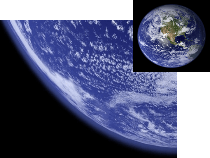
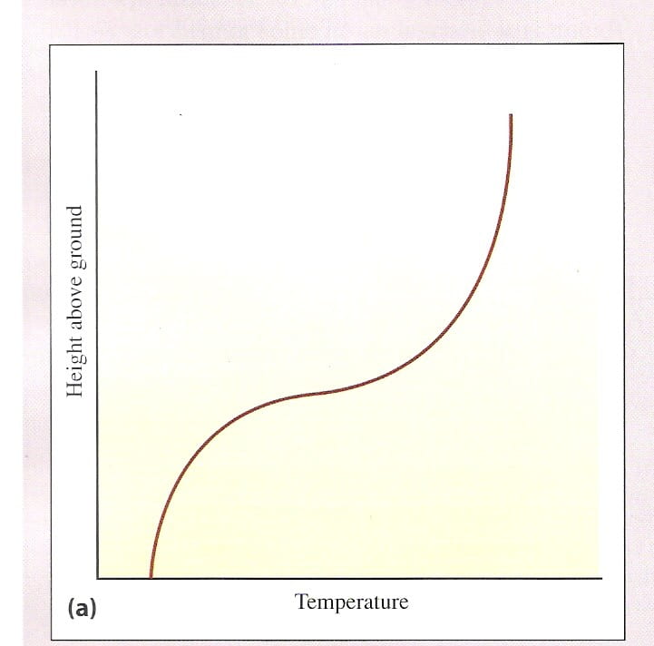
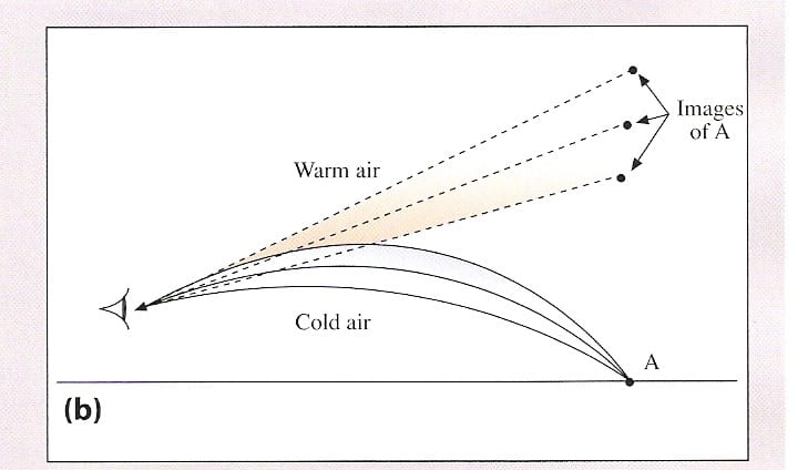
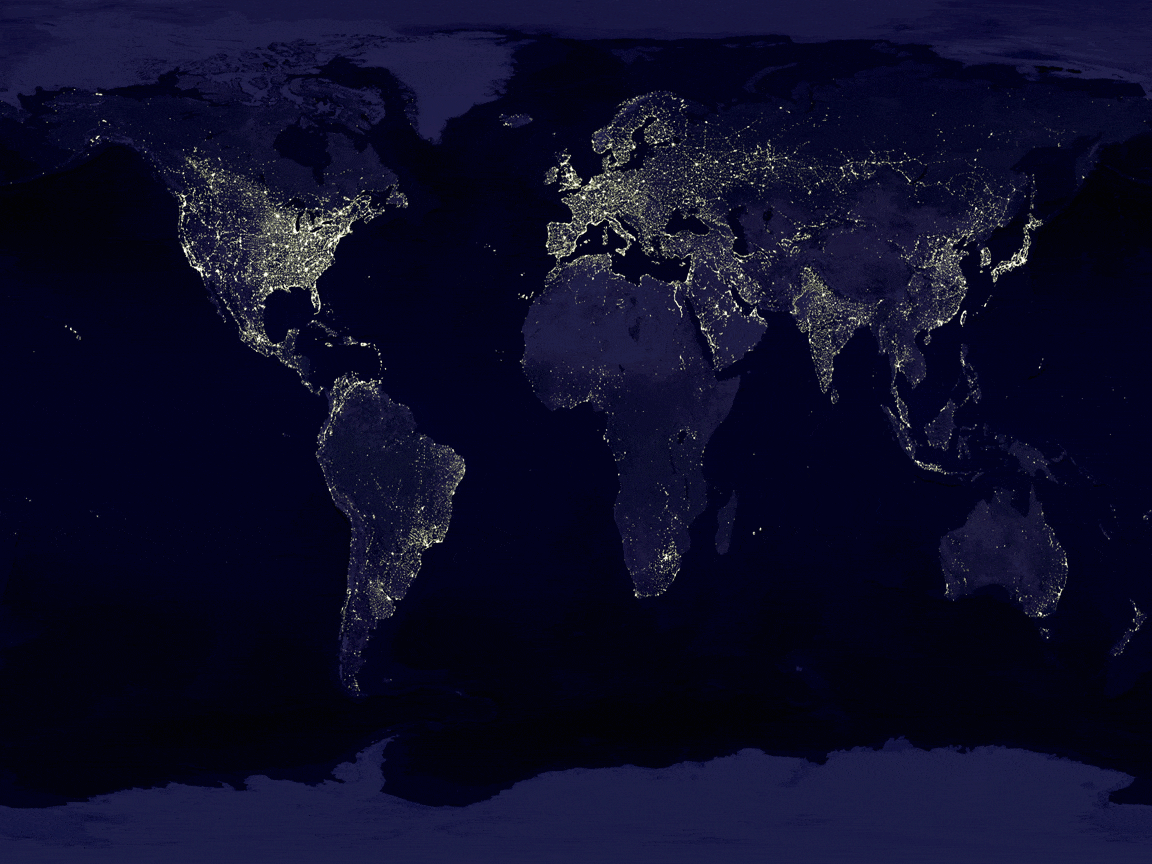
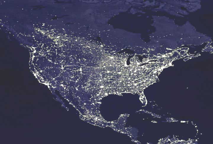
  • Figure 18.1a , Figure 18.1b : Earth from space, at night (courtesy of NASA)
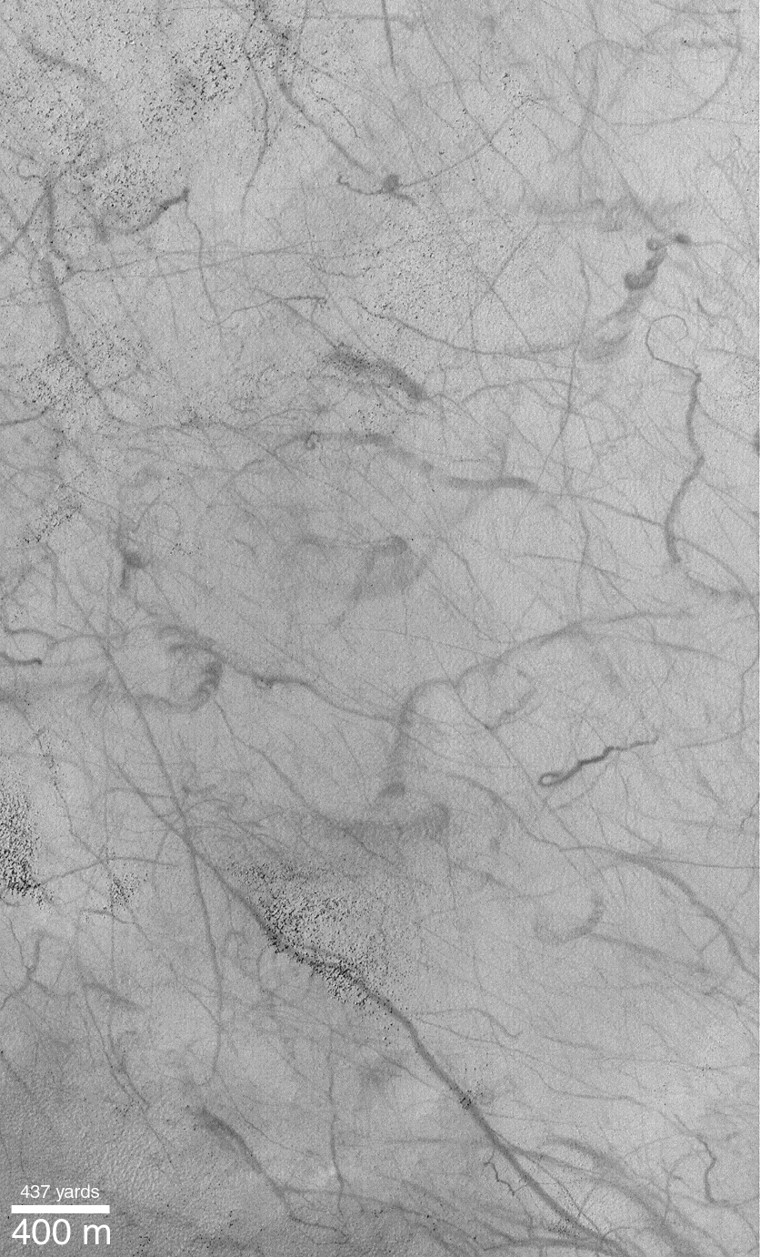
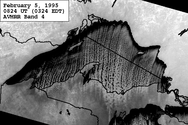
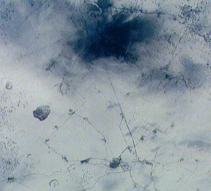
  • Figure 18.3 : Satellite view of soot-darkened snow near Troisk, in Siberia (courtesy of NASA)
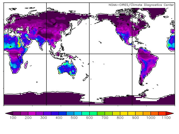
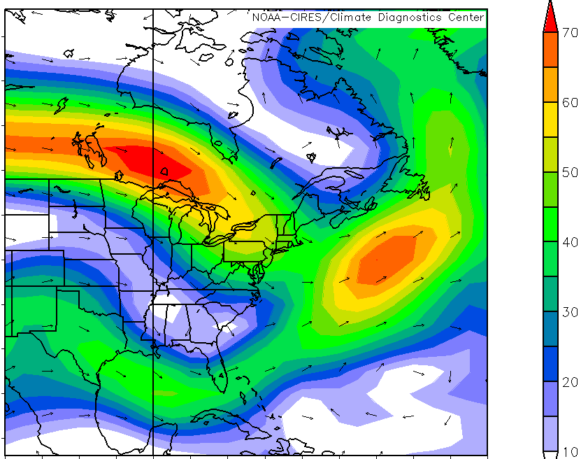
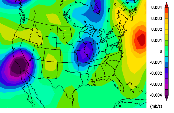
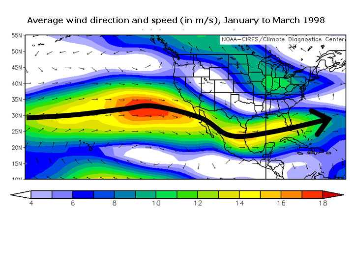
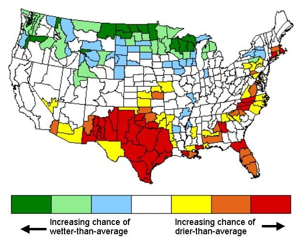
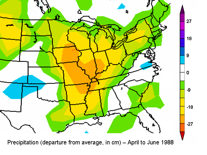
  • Figure 18.4 : Precipitation departure from average, April-June 1988 (courtesy of Climate Diagnostics Center)
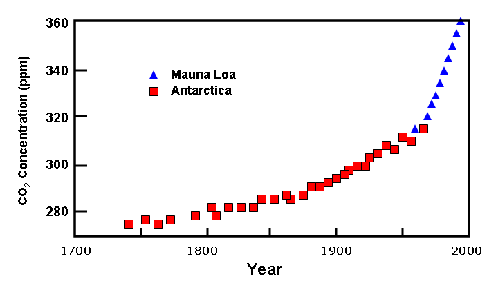
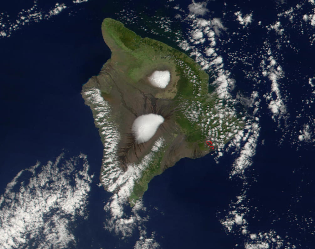
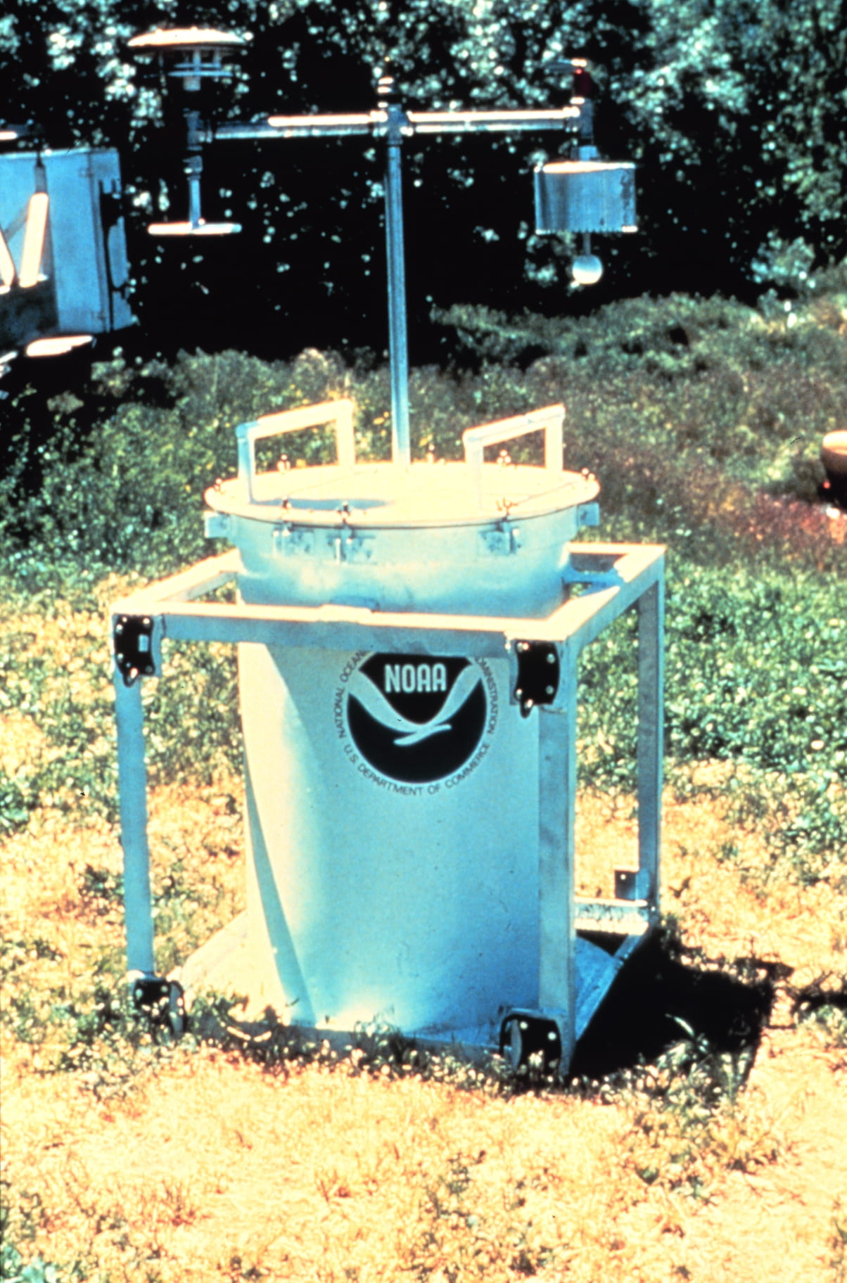
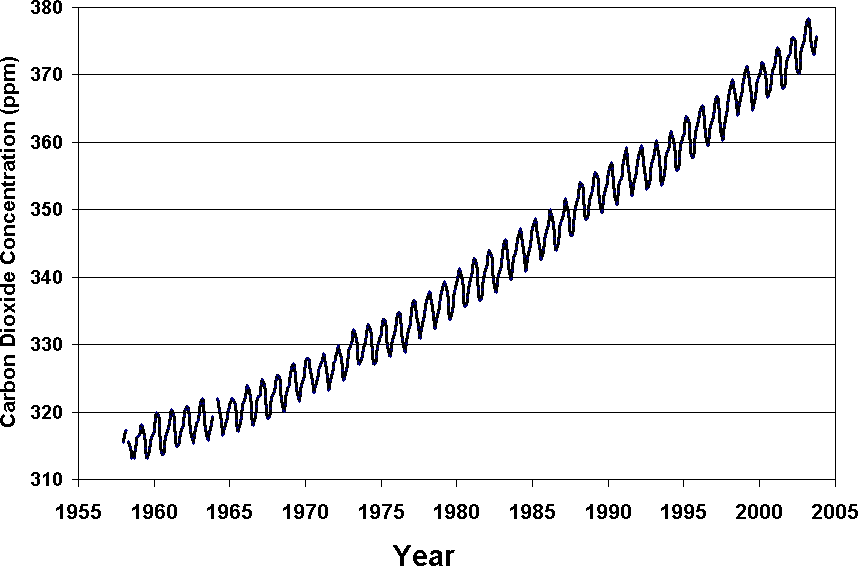
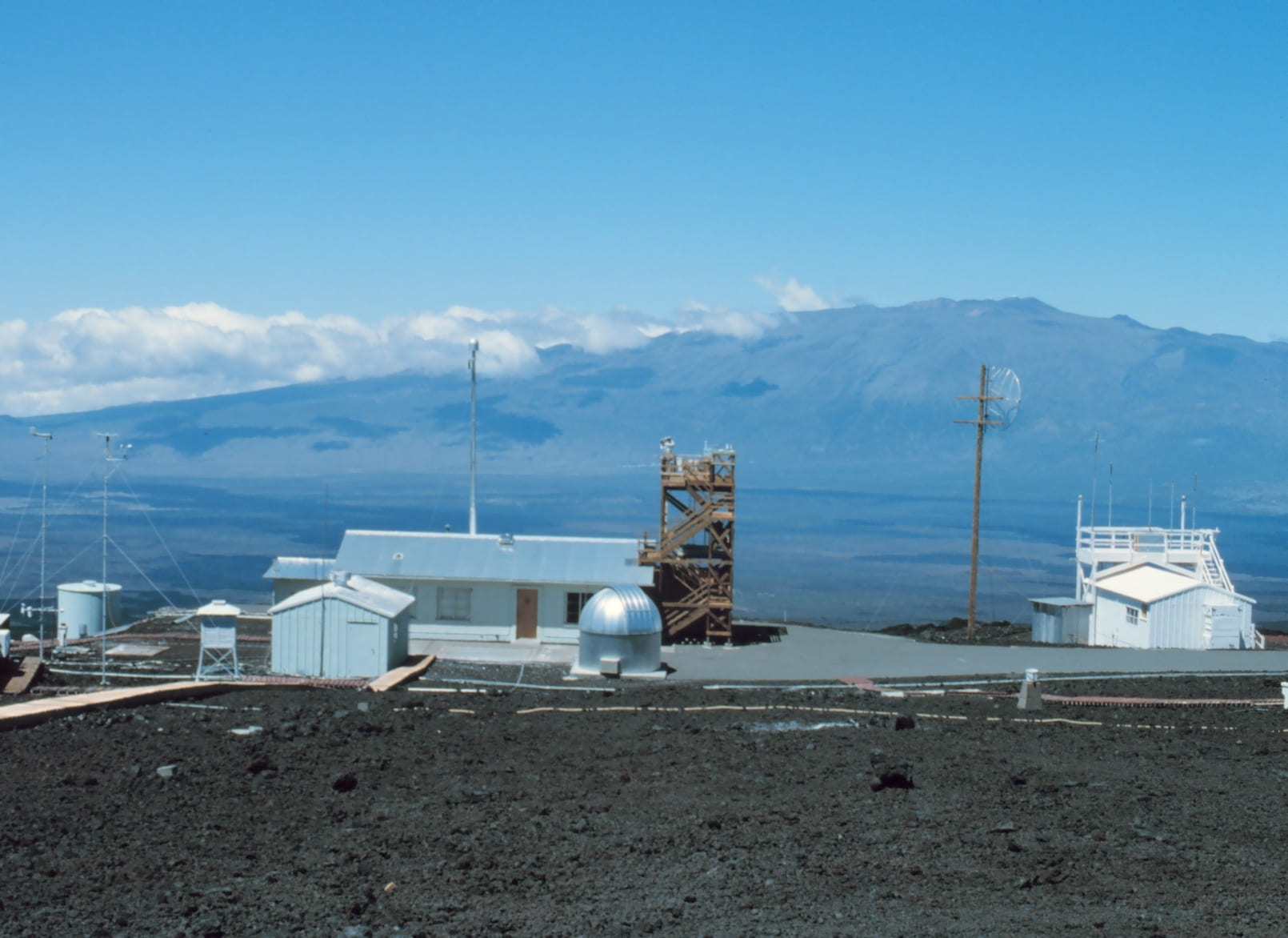
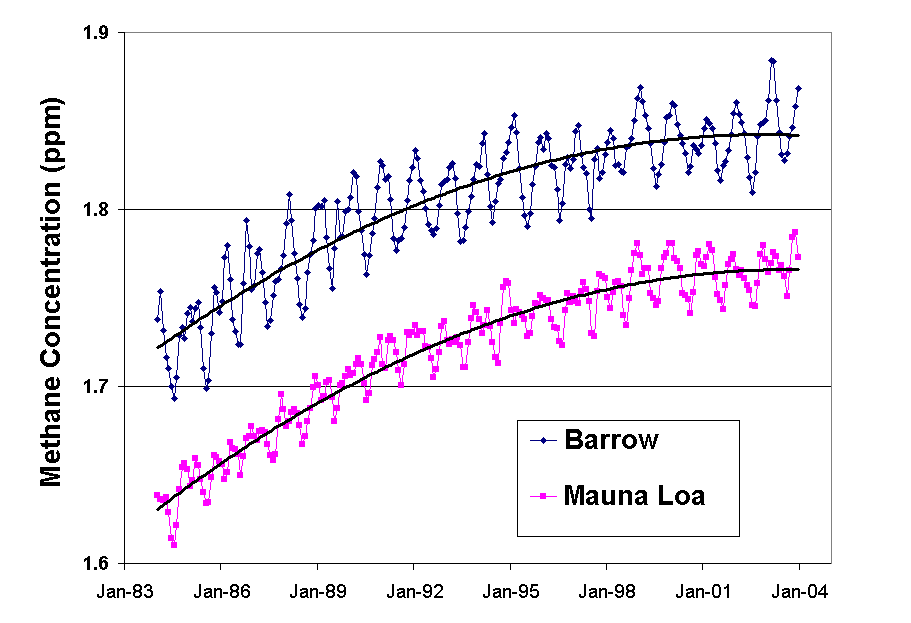
  • Figure 18.5a ,Figure 18.5b : The Mauna Loa observatory, and the Keeling curve(data from http://cdiac.esd.ornl.gov/trends/co2/sio-mlo.htm, image courtesy of NOAA)
  • Figure 18.6 : Drilling site for Greenland Ice Sheet Project 2 (courtesy of Michael Morrison, University of New Hampshire)
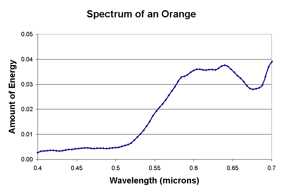
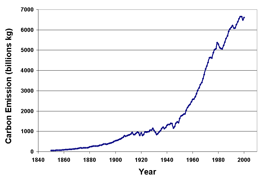
  • Figure 18.7 : Annual global carbon emissions from fossil-fule burning (data from http://cdiac.esd.ornl.gov/trends/emis/tre_glob.htm)
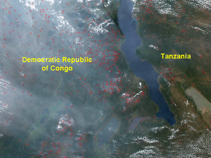
  • Figure 18.8 : Smoke and haze from fires over central Africa (courtesy of NASA)
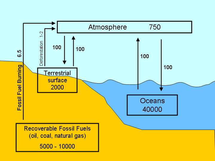
  • Figure 18.9 : Principle reservoirs of carbon and exchanges between reservoirs
  • Figure 18.10 : Time series of atmospheric methane (data from CMDL, http://www.cmdl.noaa.gov/ccgg/iadv/)
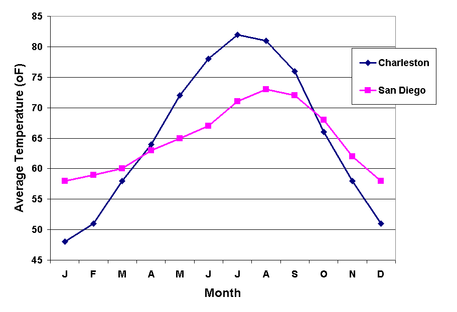
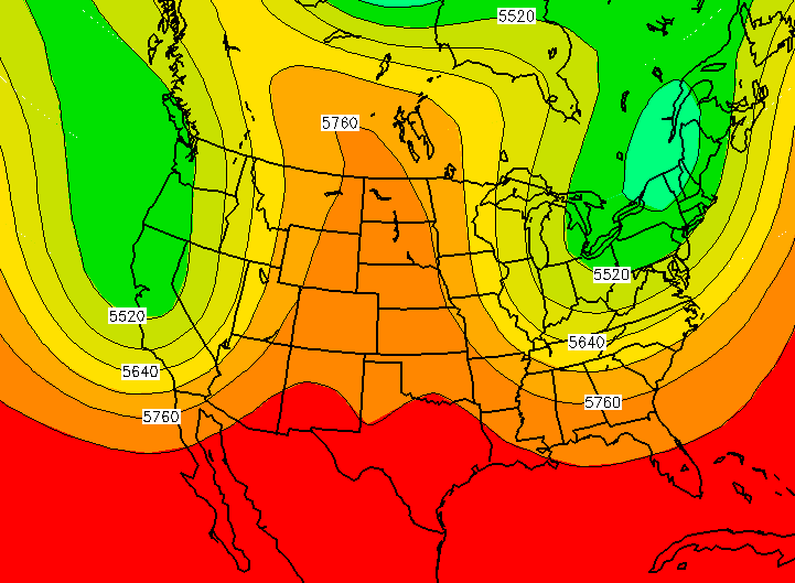
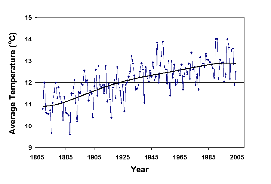
  • Figure 18.12 : Average annual temperature trend in Central Park, New York City
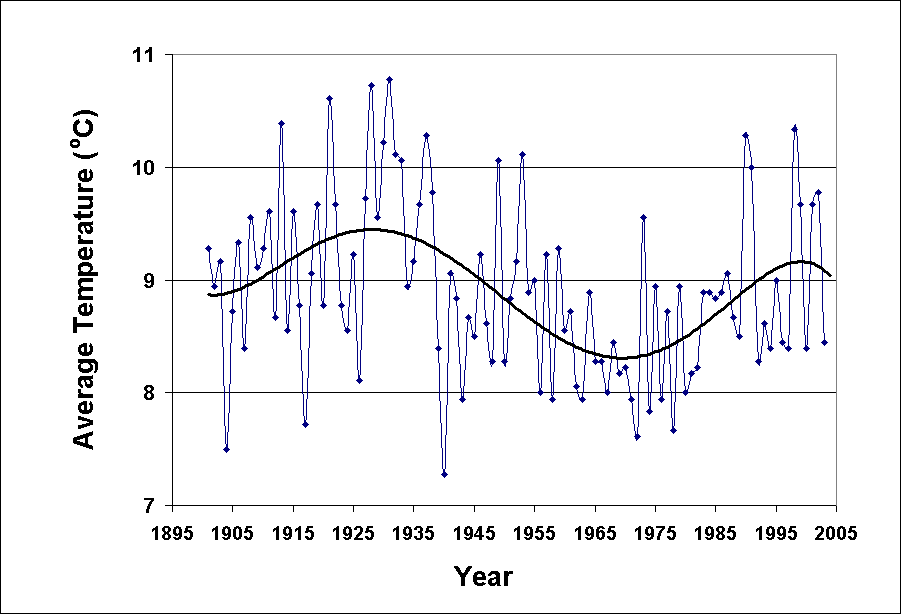
  • Figure 18.13 : Average annual temperature trend in Albany, NY
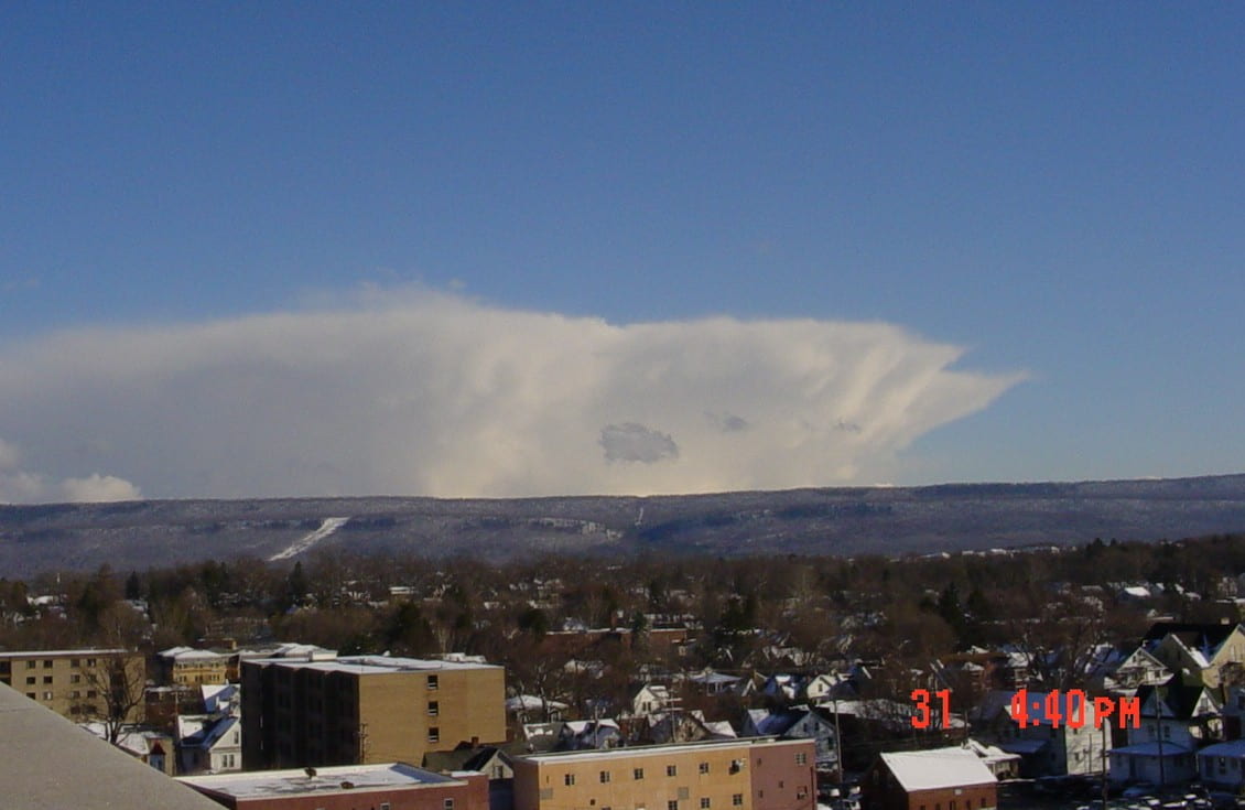
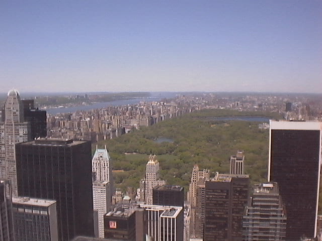
  • Figure 18.14 : View of Central Park (courtesy of National Weather Service, Upton, NY)
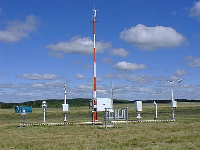
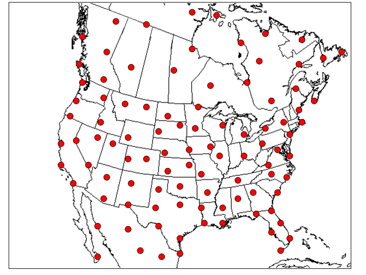
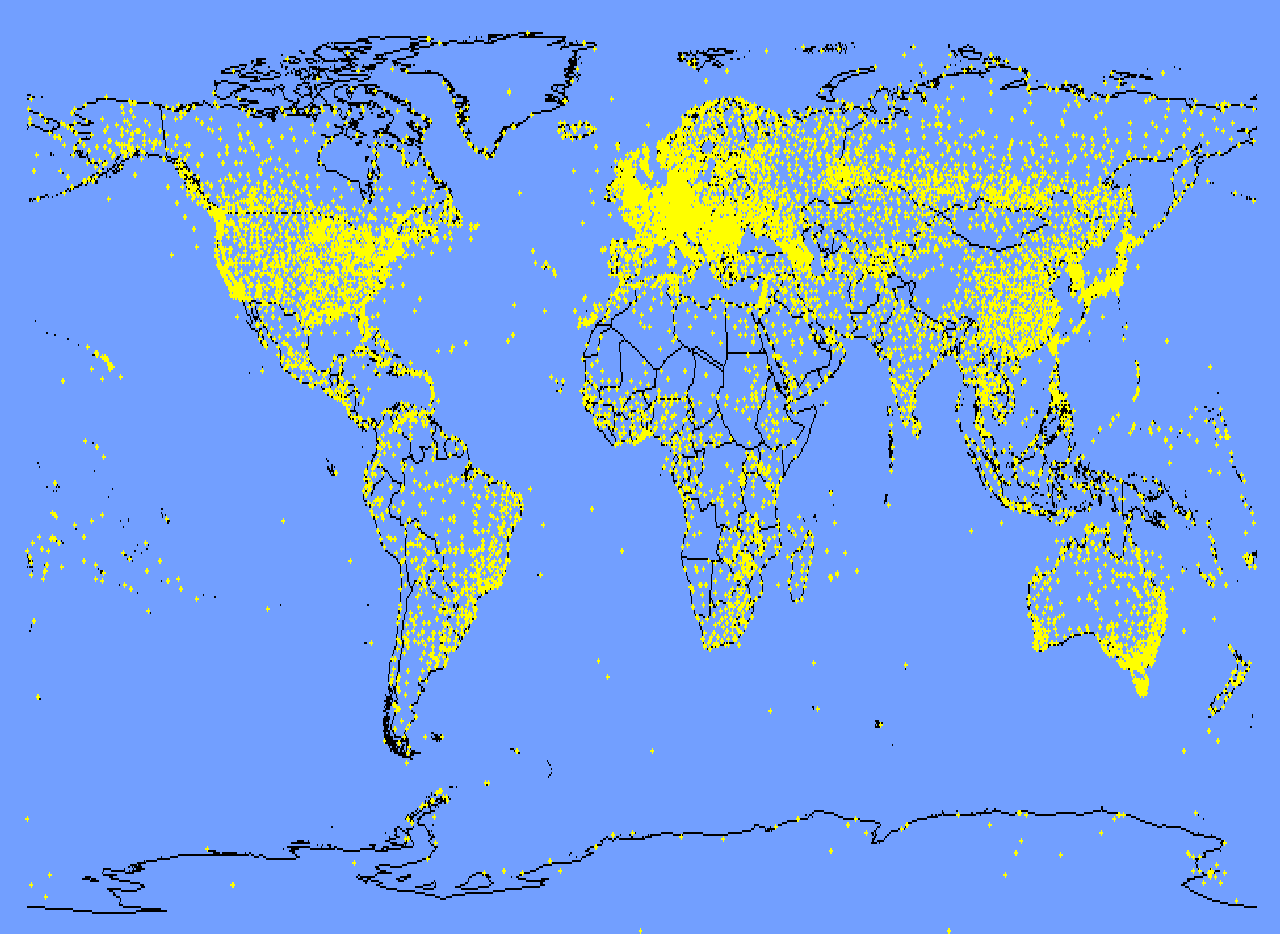
  • Figure 18.15 : Surface weather observing stations, a global view
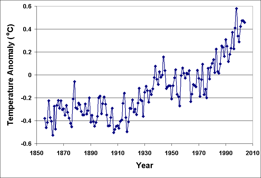
  • Figure 18.16 : Time series of global surface average air temperature since the mid 1850s (data from http://www.cru.uea.ac.uk/cru/data/temperature/)
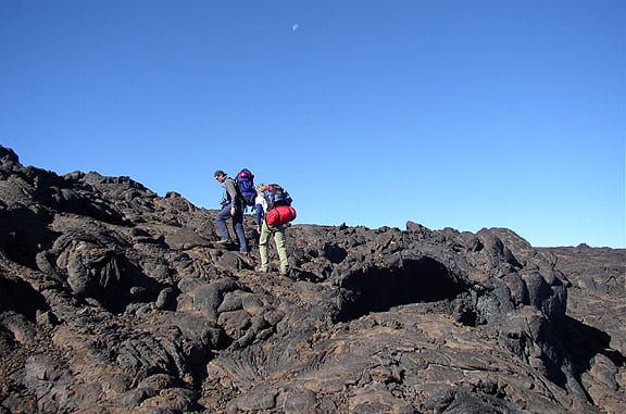
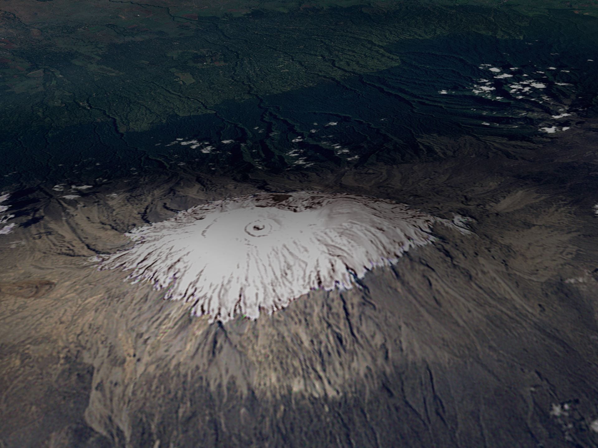
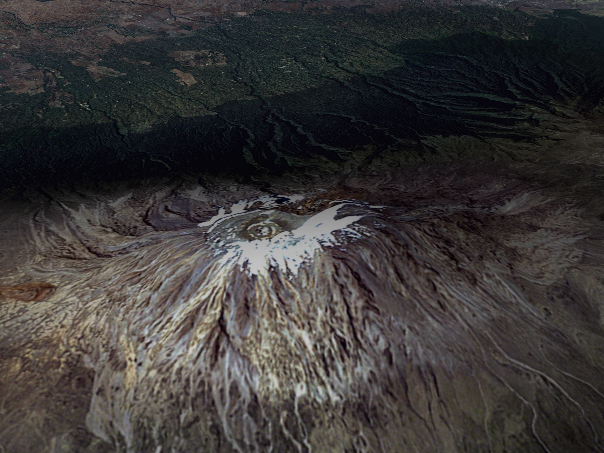
  • Figure 18.17a , Figure 18.17b : Satellite images of Mount Kilimanjaro, taken seven years apart, show reduction in ice on the mountain (courtesy of NOAA)
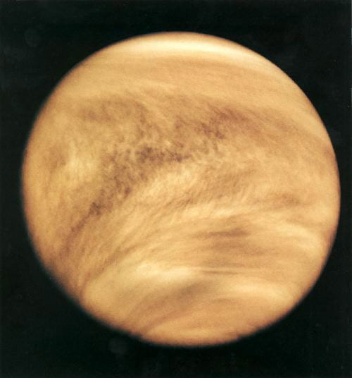
  • Figure 18.18 : The Planet Venus (courtesy of NASA)
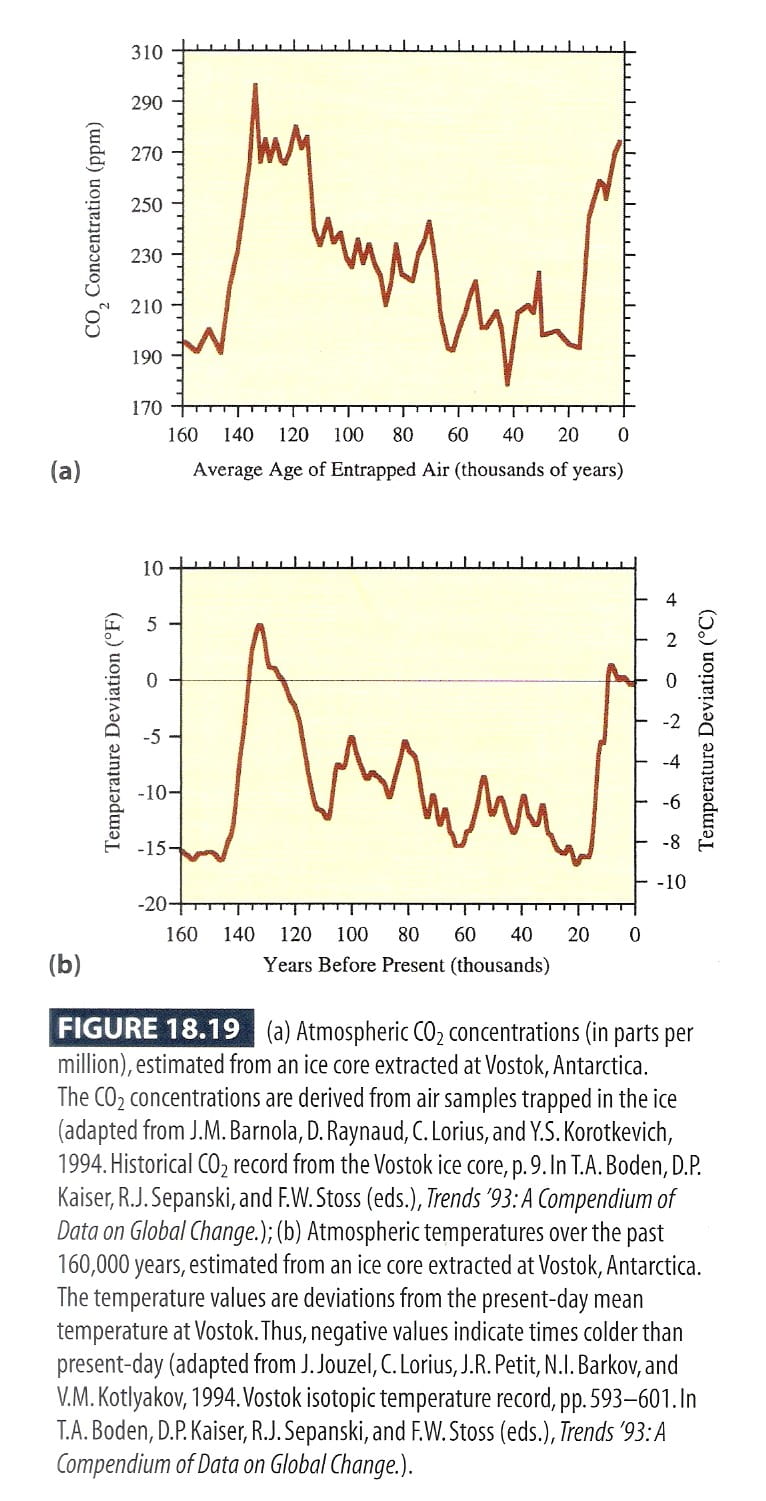
  • Figure 18.19 : Atmospheric carbon dioxide concentrations and average air temperatures, derived from Vostok ice core (data from Trends '93: A Compendium of Data on Global Change)
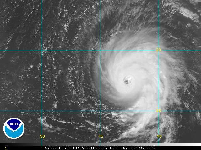
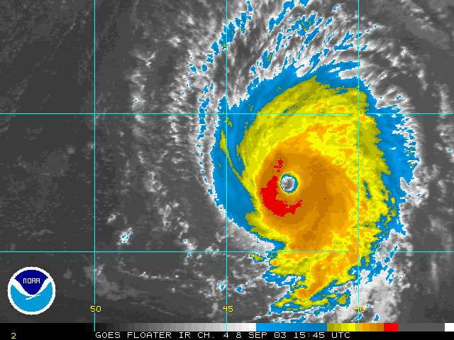
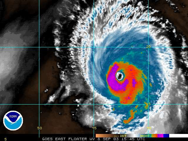
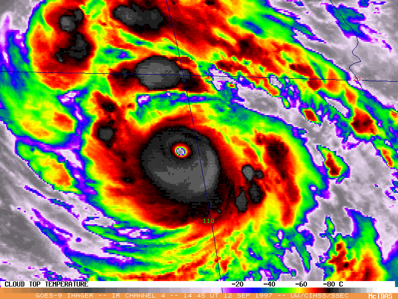
  • Figure 18.20 : Stratospheric aerosols visible from satellite imagery, after the eruption of Mount Pinatubo (courtesy of Pat McCormick, NASA)
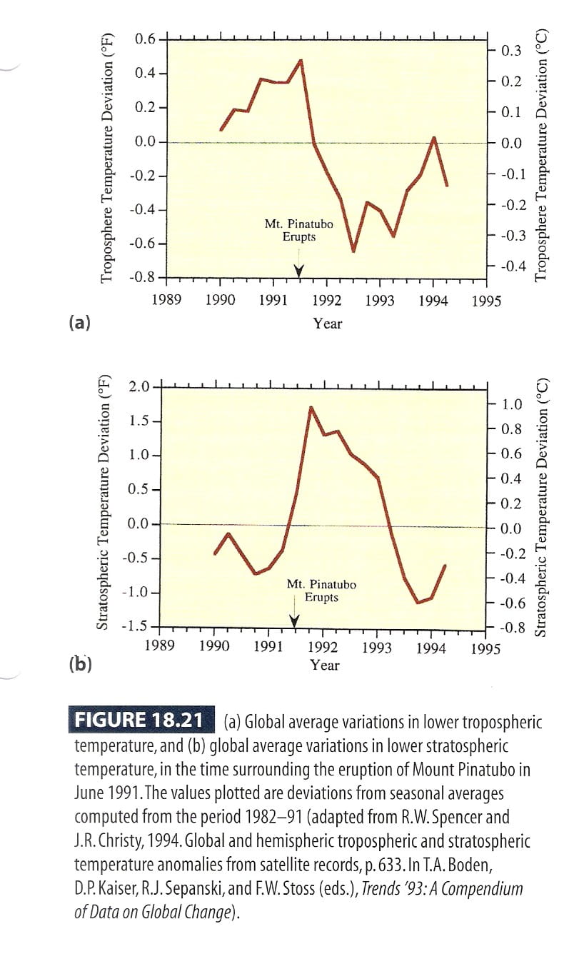
  • Figure 18.21 : Global average temperature variations in the lower troposphere and lower stratosphere, surrounding the eruption of Mount Pinatubo (data from Trends '93: A Compendium of Data on Global Change)
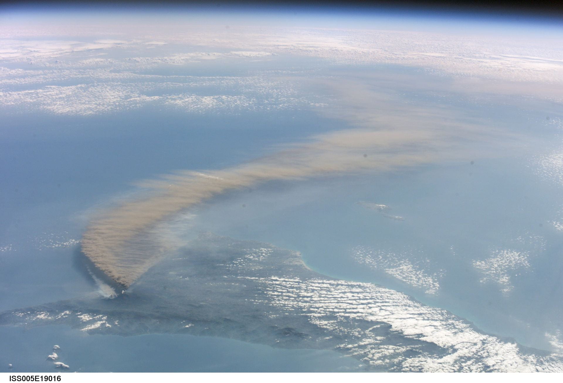
  • Figure 18.22 : Ash plume from Mount Etna, October 2002 (courtesy of NASA)
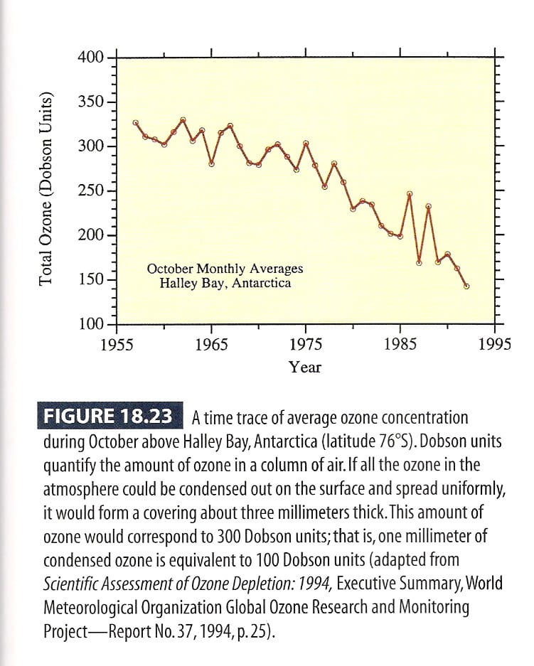
  • Figure 18.23 : Trend in October average ozone over Halley Bay, Antarctic (data from Scientific Assessment of Ozone Depletion: 1994)
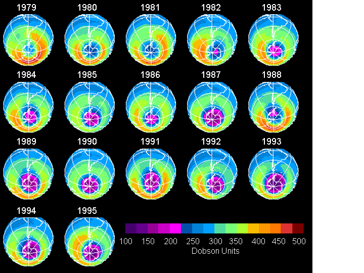
  • Figure 18.24 : Average stratospheric ozone levels in October, 1979 to 1995 (courtesy of NASA)
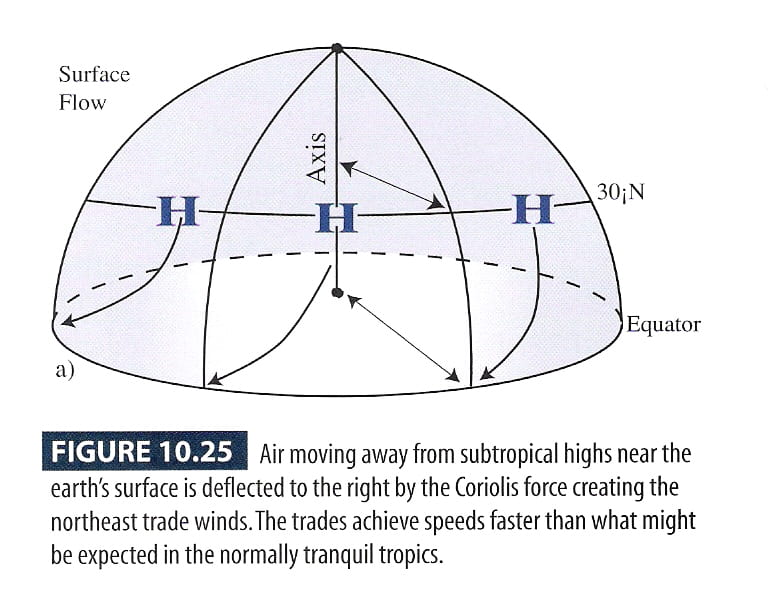
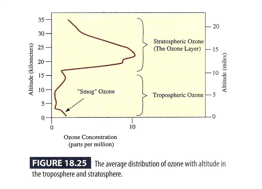
  • Figure 18.25 : Average distribution of ozone with altitude in the troposphere and stratosphere
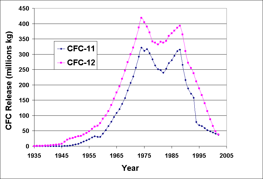
  • Figure 18.26 : Annual releases of CFC-11 and CFC-12 (data from http://afeas.org/prodsales_download.html)
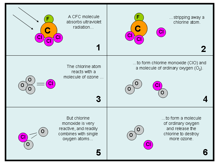
  • Figure 18.27 : Steps that lead to ozone destruction by CFCs
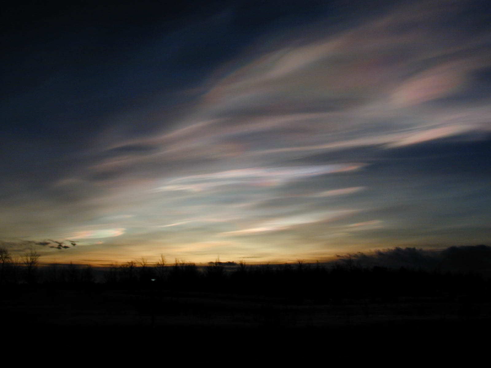
  • Figure 18.28 : Polar stratospheric clouds (courtesy of Lamont Poole, NASA)
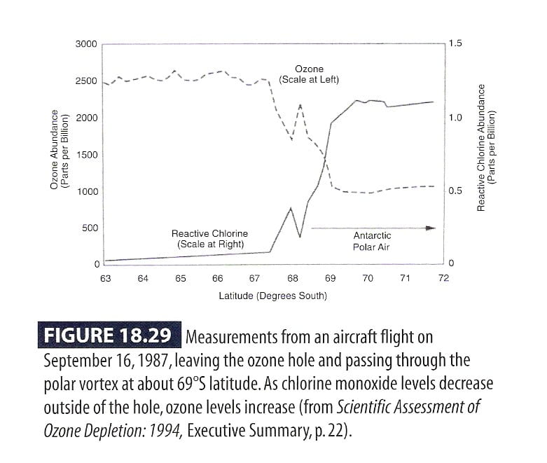
  • Figure 18.29 : Measurements of ozone and chlorine monoxide inside and outside the ozone hole (data from Scientific Assessment of Ozone Depletion: 1994)
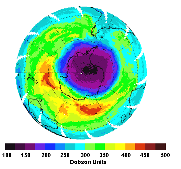
  • Figure 18.30 : Stratospheric ozone levels on October 6, 2004 (courtesy of NASA)
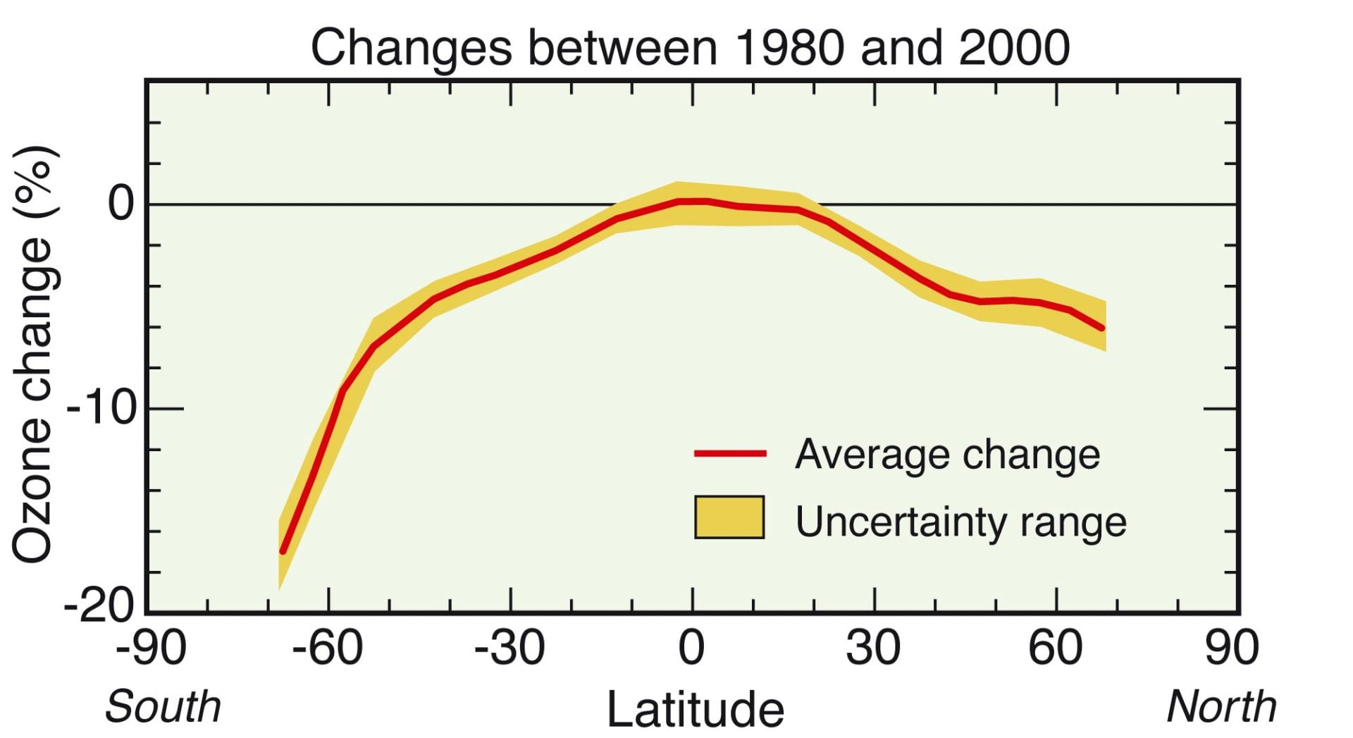
  • Figure 18.31 : Trends in stratospheric ozone from 1980 to 2000, as a function of latitude (courtesy of NOAA)
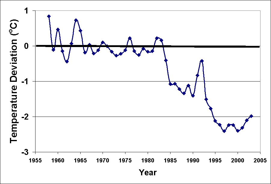
  • Figure 18.32 : Average lower stratospheric temperature since 1958 (data from http://cdiac.esd.ornl.gov/trends/temp/angell/data.html)
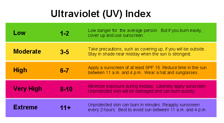
  • Figure 18.33 : The Ultraviolet (UV) Index
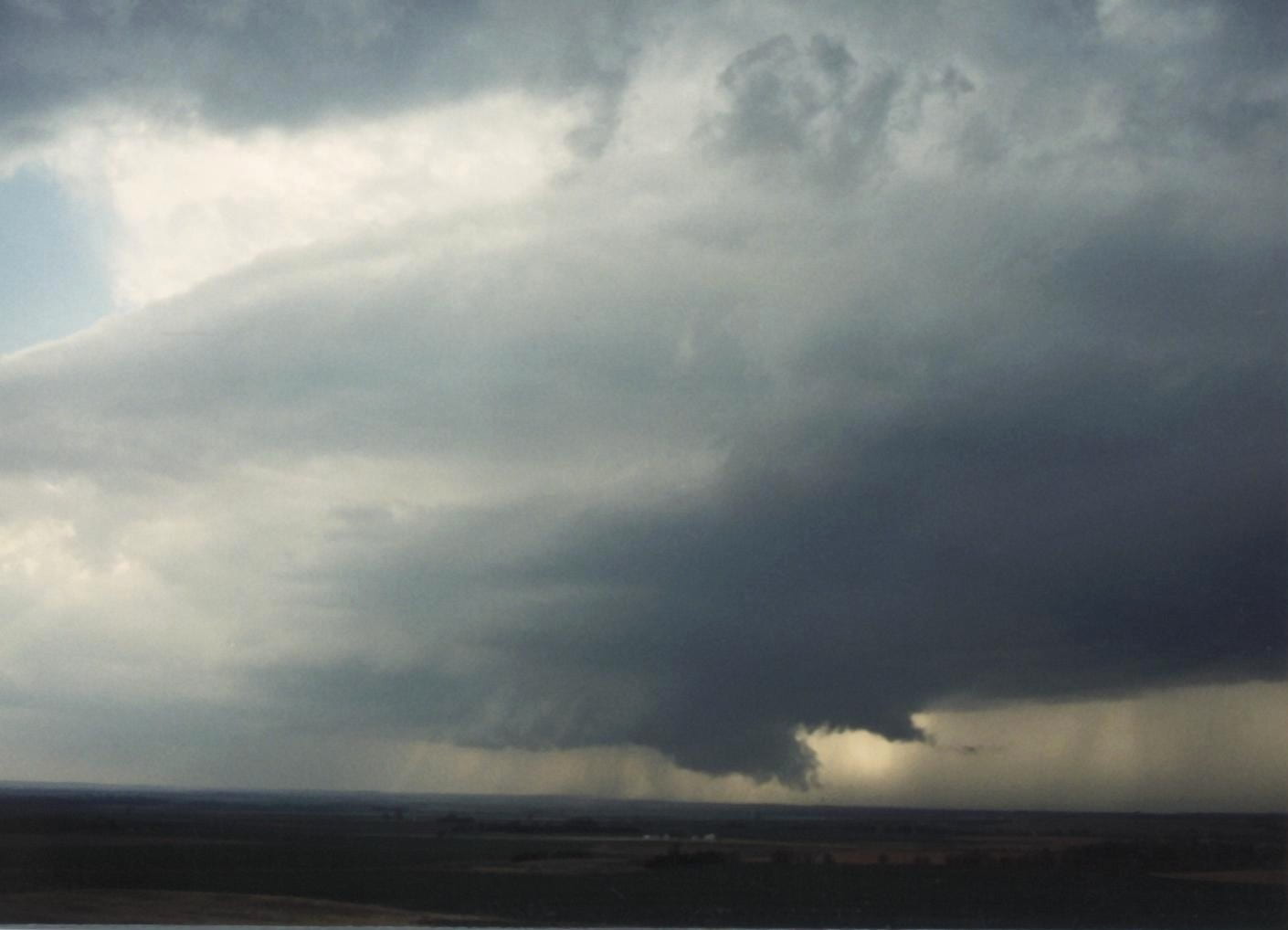
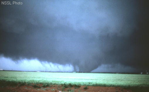
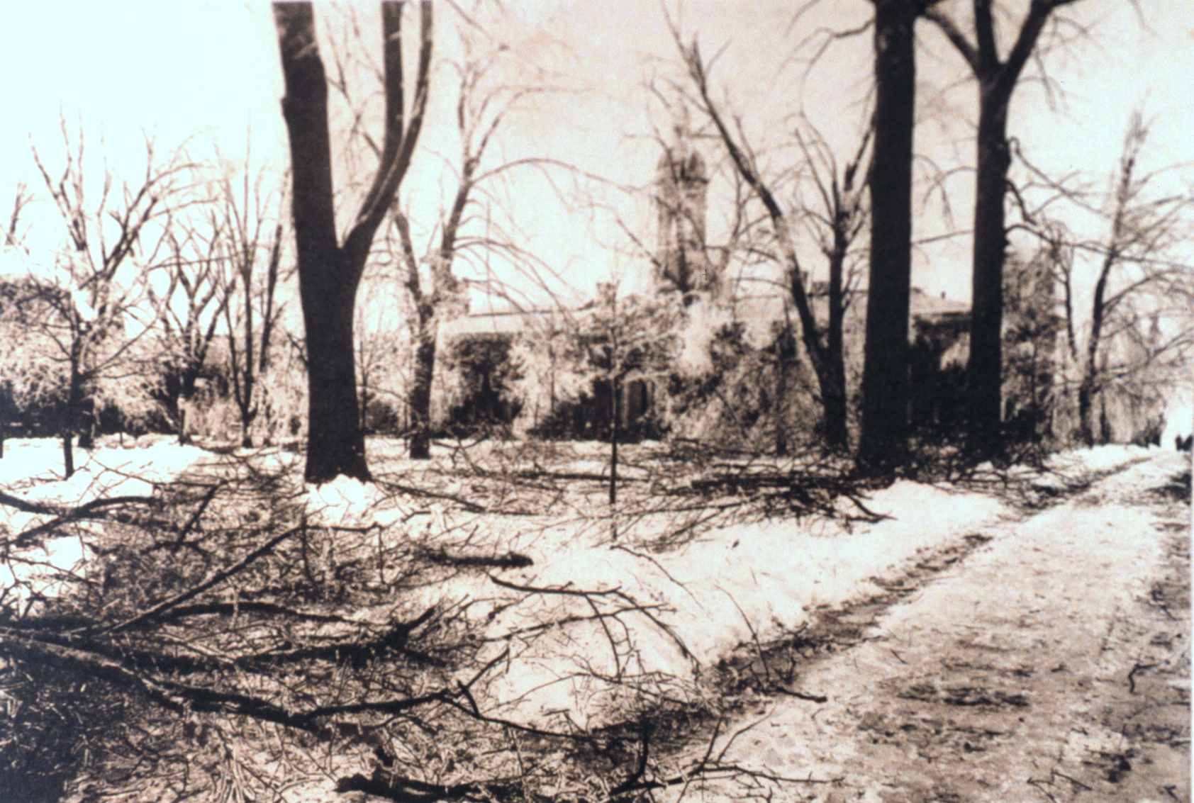
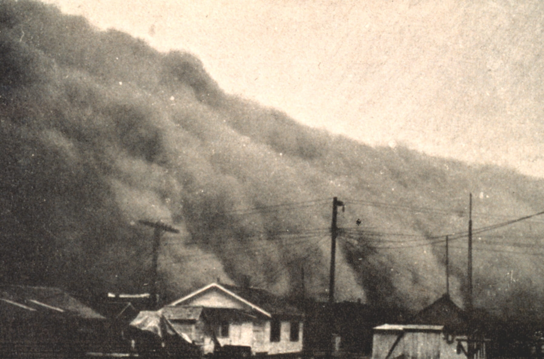
  • Figure 18.34 : A wall of dust approaches a Kansas town in 1935 (courtesy of NOAA)
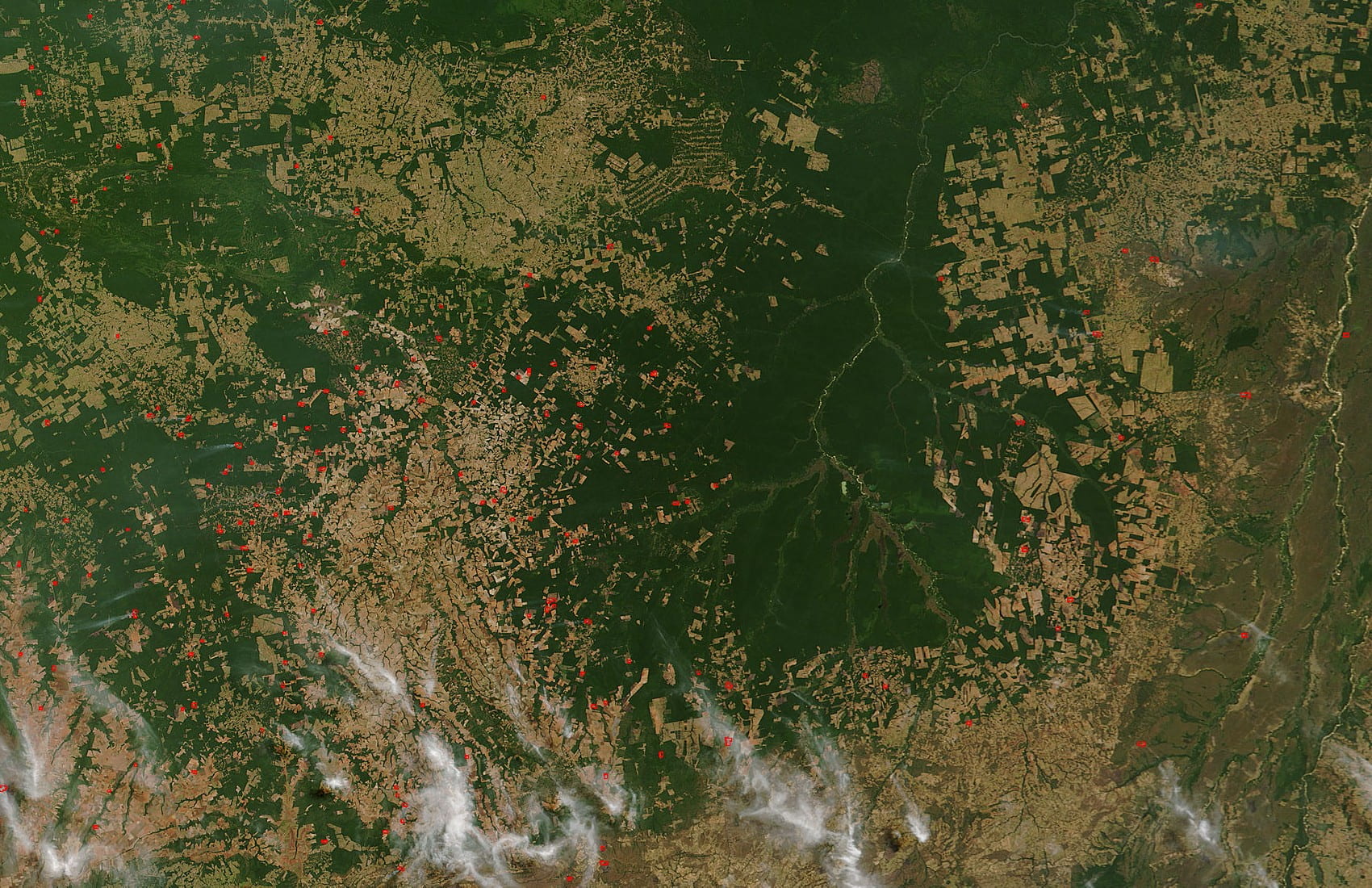
  • Figure 18.35 : Haze from biomass burning over the Amazon (courtesy of NASA)
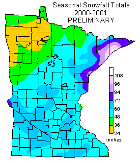
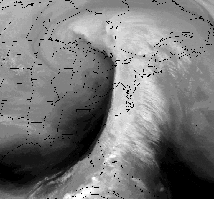
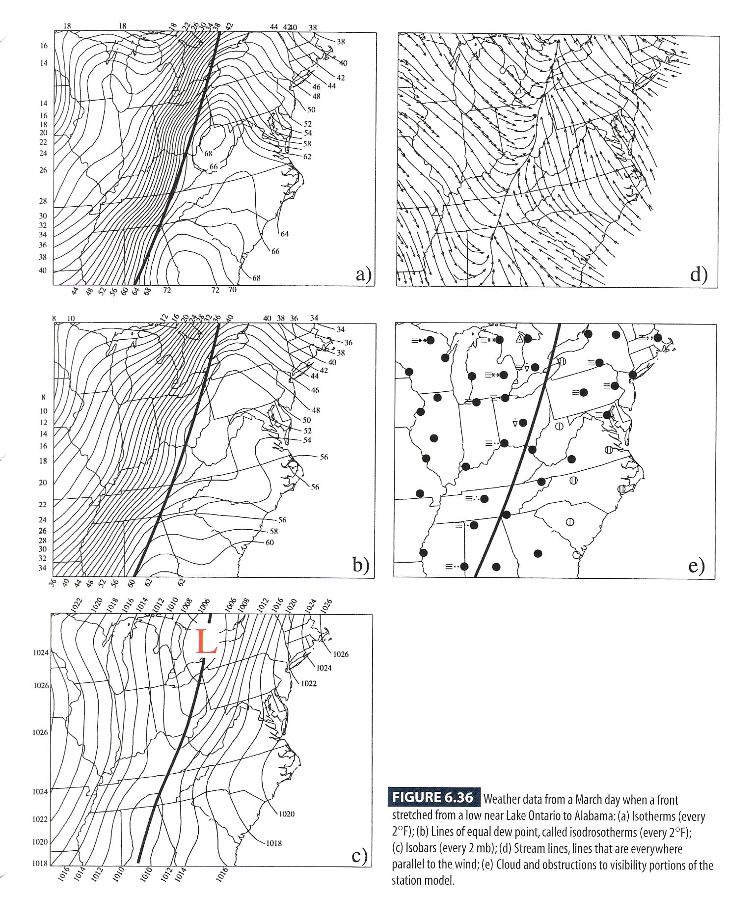
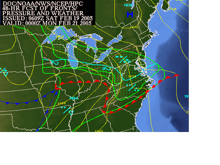
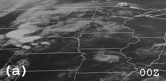
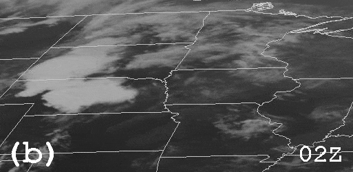
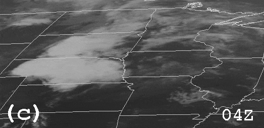
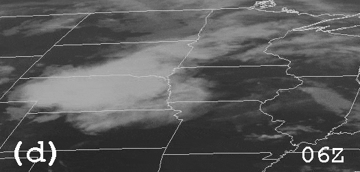
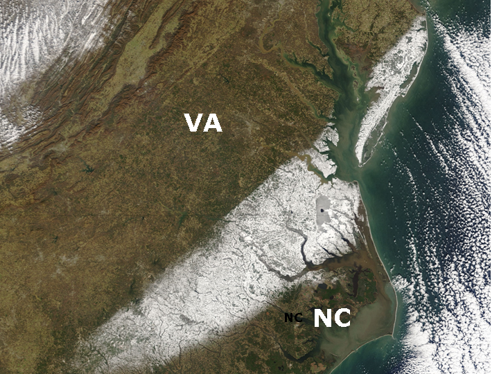
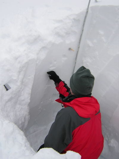
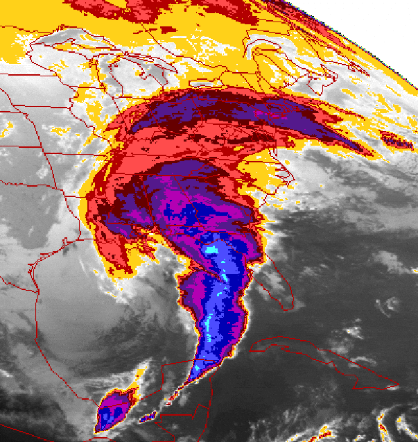
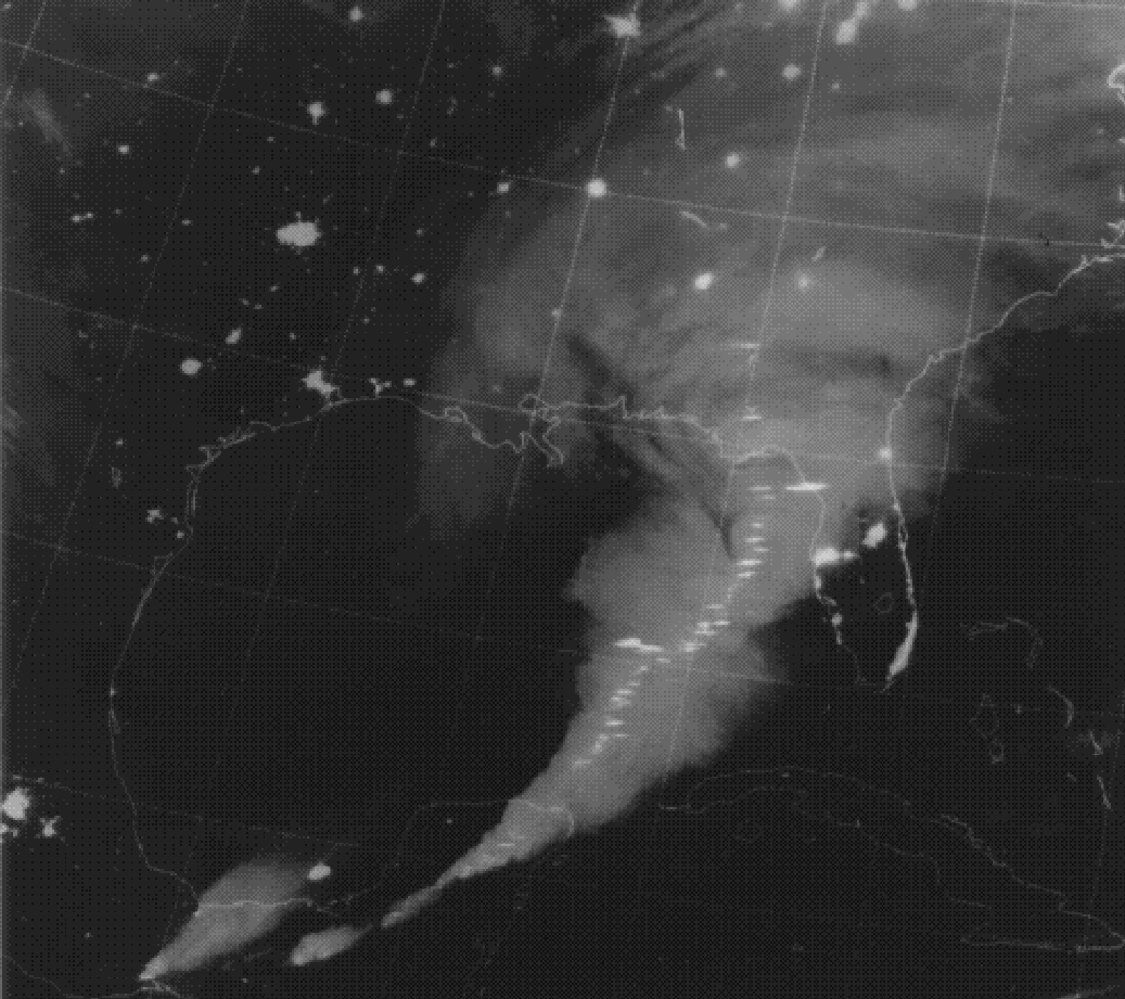
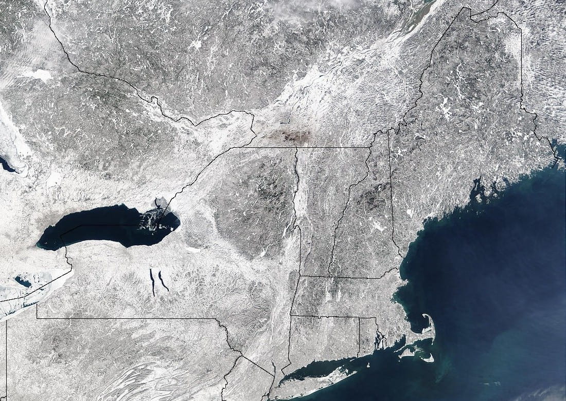
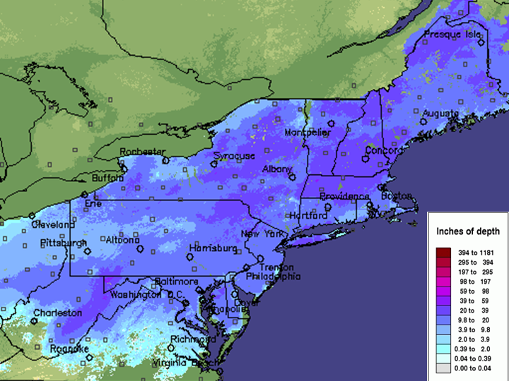
  • Figure 18.36a ,Figure 18.36 : Snowcover in the wake of the President's Day snowstorm of 2003 (courtesy of NOAA)
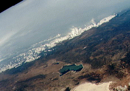
  • Figure 18.37 : View of deforestation in the Amazon (courtesy of NOAA)
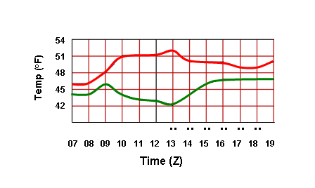
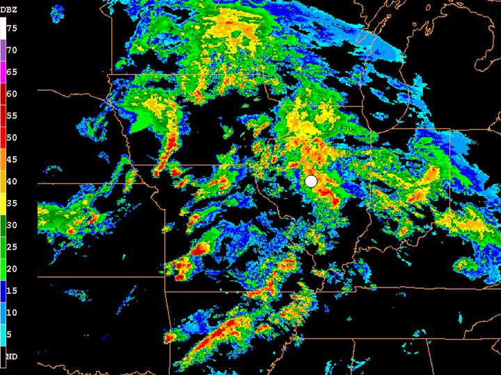
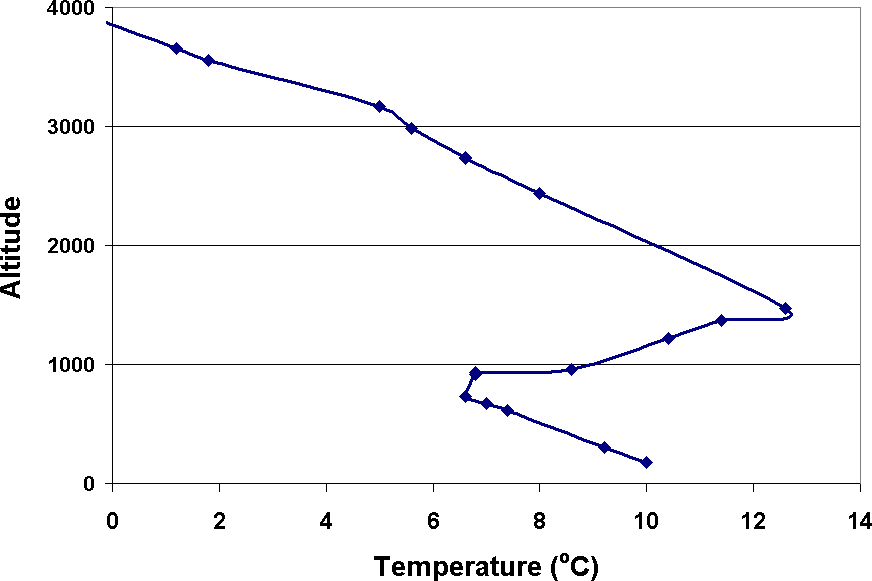
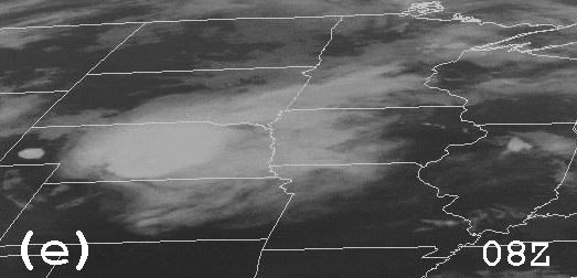
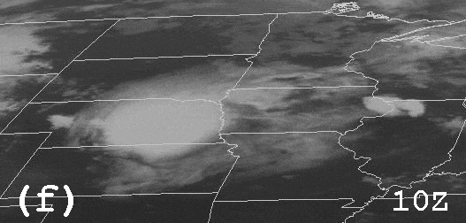
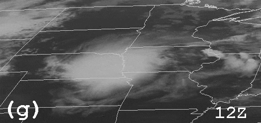
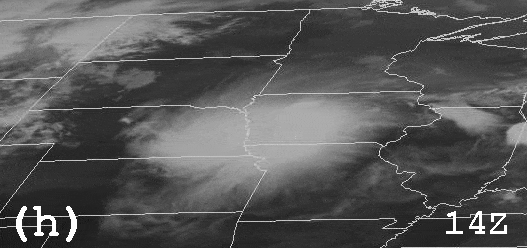
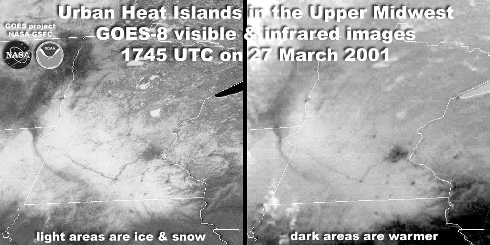
  • Figure 18.38 : The urban heat island of Minneapolis/St. Paul, MN, visible on satellite imagery (courtesy of NOAA)
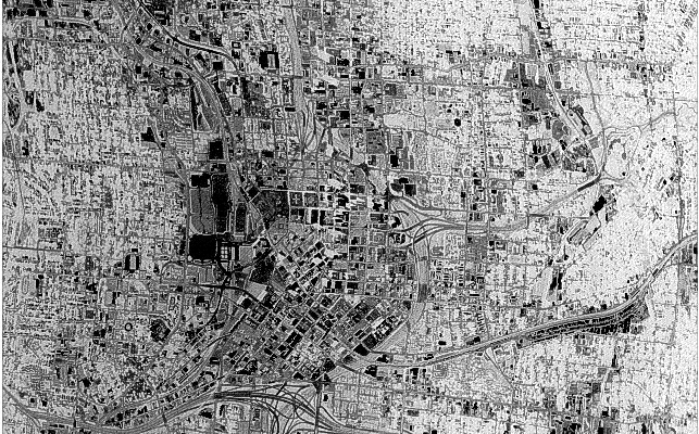
  • Figure 18.39 : High-resolution infrared satellite image of downtown Atlanta, GA (courtesy of NASA)
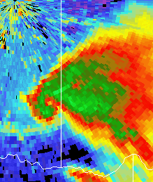
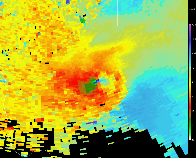
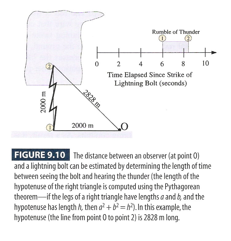
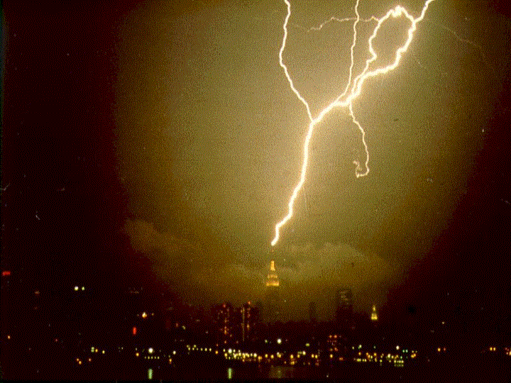
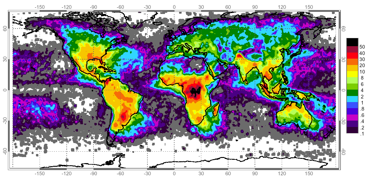
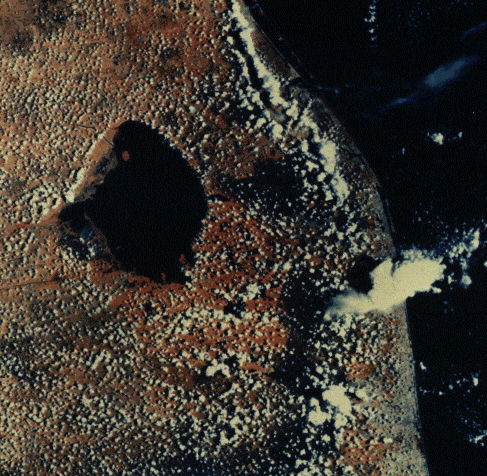
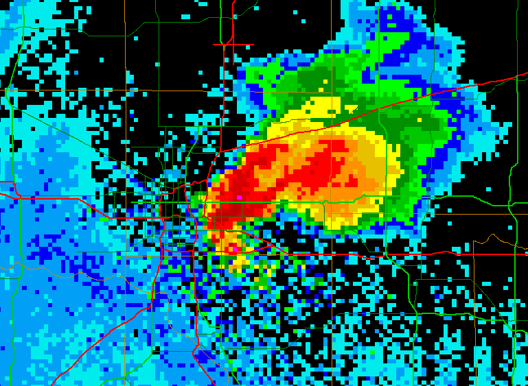
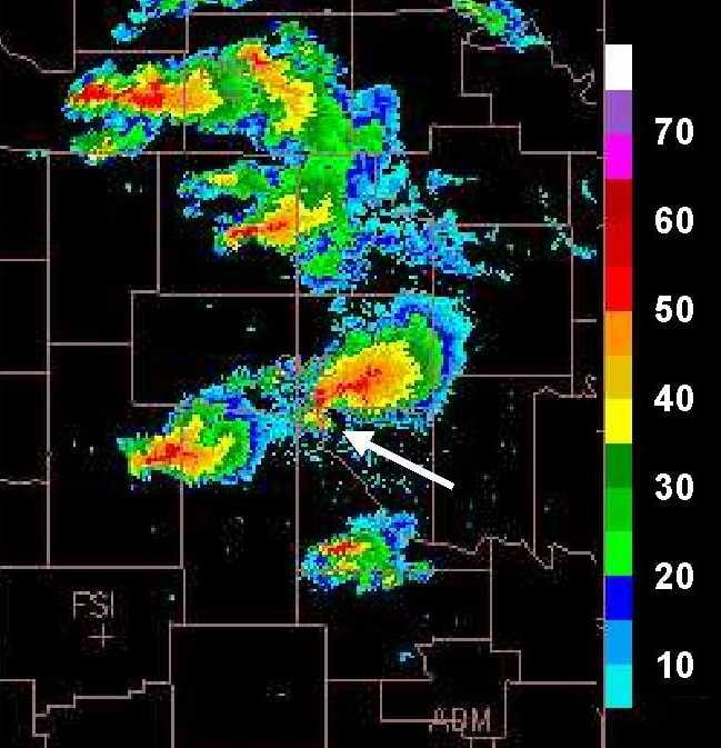
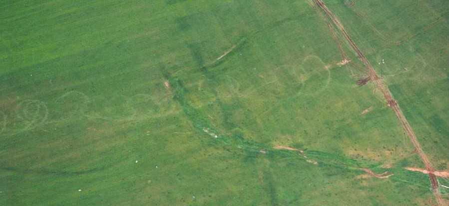
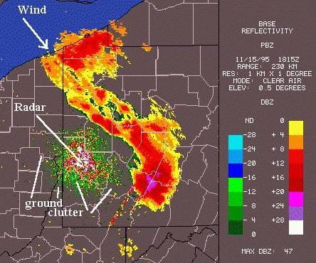
  • Figure 18.40 : Distribution of cloud-to-ground lightning strikes around Houston, TX, from 1989 to 2001 (courtesy of the Lightning Project at Texas A&M University)
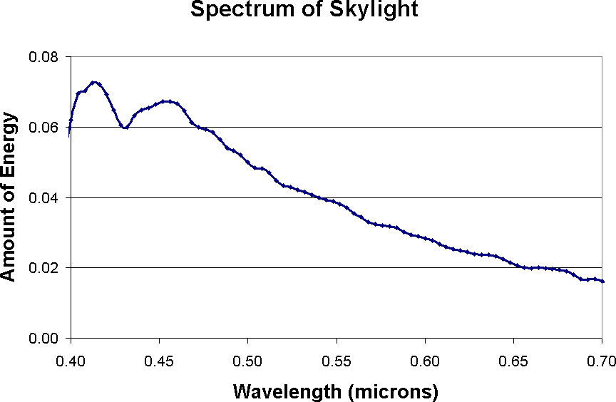
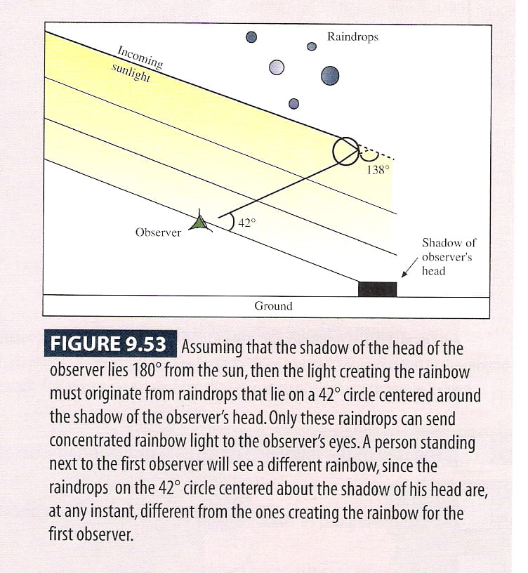
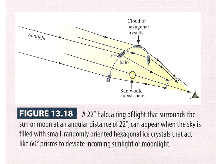
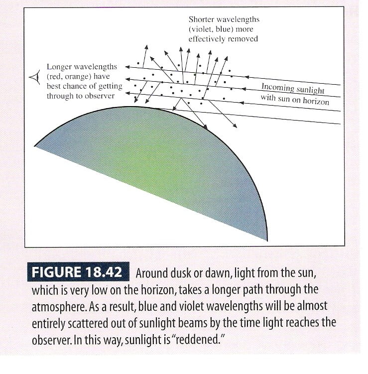
  • Figure 18.42 : Why sunsets and sunrises are reddish